The beauty of traditional publishing is that all the writer has to do is write. That’s it. You make shit up and write it down. You finish the manuscript, you take it to the Post Office or Federal Express, you drop it in an envelope, send the damned thing off and that’s it. You can forget about it and move on to the next project. Easy peasy, as they say.
Some other poor bastard (or several poor bastards) will have to do the grunt work of copy editing, and considering issues of typeface, and dealing with formatting, and coming up with cover art.
But e-publishing makes every writer a poor bastard—at least in the sense of all the grunt work that’s necessary to prepare the manuscript for publication. Copy editing? You have to do it. Typeface and formatting? Figure it out. Cover art? Dude, it’s all up to you. You can stare at your computer and say “Dammit, Jim—I’m a doctor, not an engineer.” But you still have to get the warp engines back on line.
I’m okay with the copy editing. I hate it, but I can do it. I don’t know dick about typeface, but I can see that there are certain industry standards and follow those. I can cope with the formatting because the e-publishing software makes it a bit easier. But cover art? Dammit, Jim—I’m a writer, not a graphic designer.
Graphic designers never get the credit they deserve. I’ve known this for a long time—partly because graphic designers keep telling me it’s so, and partly because I’ve seen graphic designers make almost unnoticeable changes that somehow magically turns a dull design into one that seizes and holds the eye and the imagination. So I’ve known graphic designers have their own peculiar genius, but now that I’ve tried to build a book cover, I appreciate it all the more.
 I tried to take a lot of things into account. The cover is for a book of non-traditional detective stories, so I wanted the cover to have a light noir-ish vibe—somewhat urban, but not quite hard-boiled. I wanted it to relate to something that appears in the stories—a setting, an object, an atmosphere. I wanted the cover to be clean and simple and somewhat austere.
 I guess I’ve made maybe a couple dozen different covers now. They all look too simplistic to me. They look like—well, they look like I made them. They don’t look to me like real book covers. I spent an inordinate amount of time looking at e-book covers on Amazon.com and B&N.com, and I’ve got myself so turned around at this point that they don’t look like real book covers either.
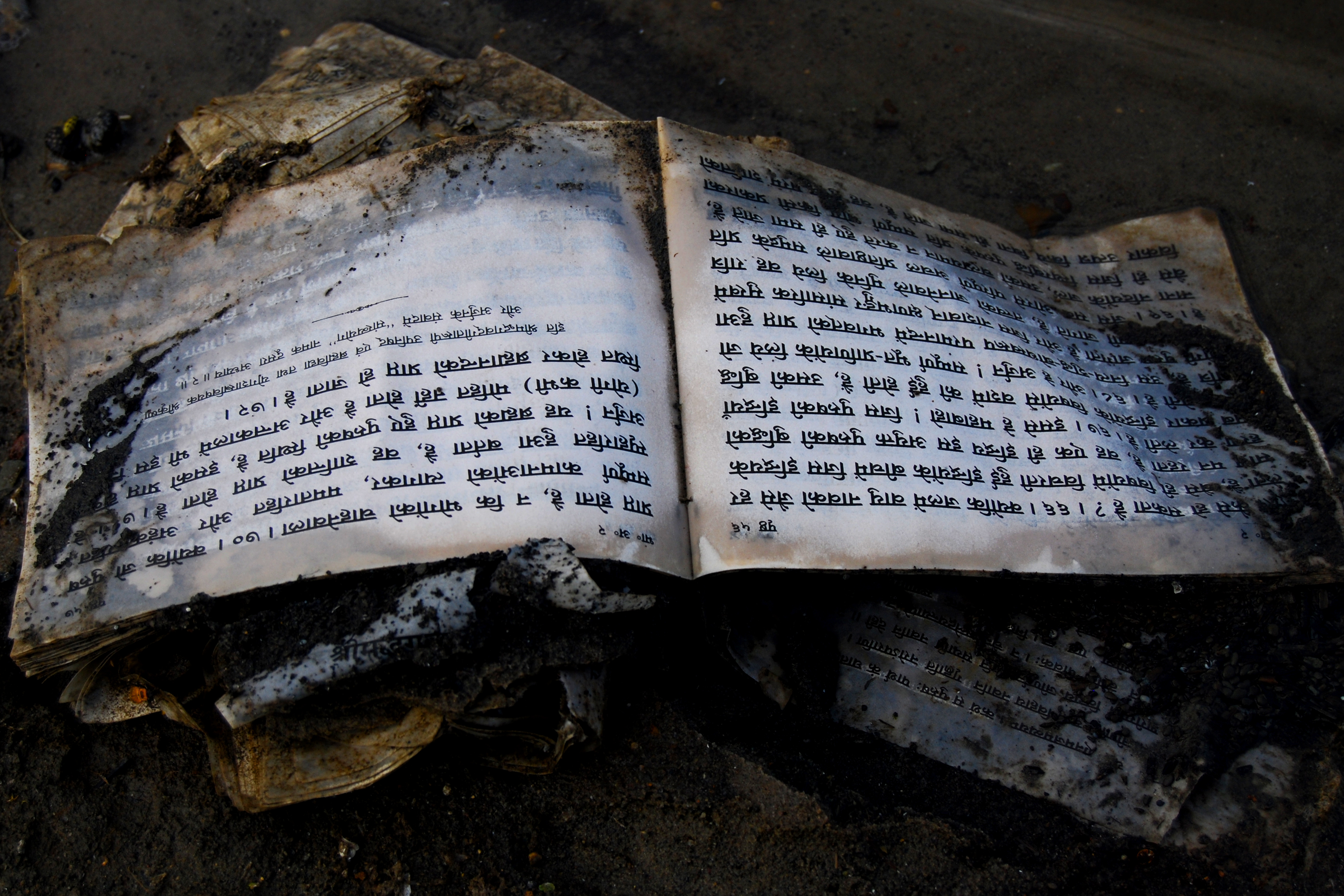
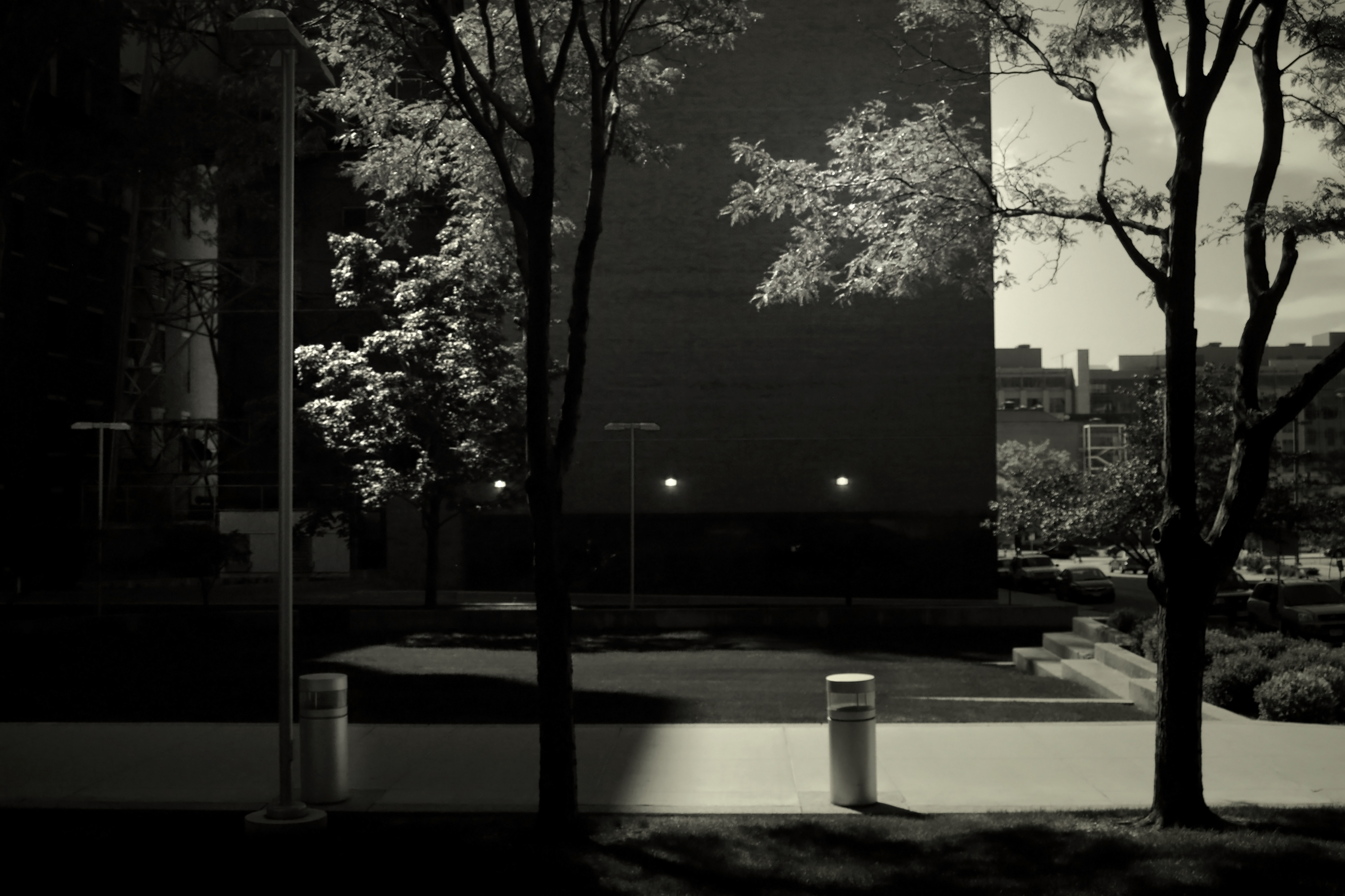
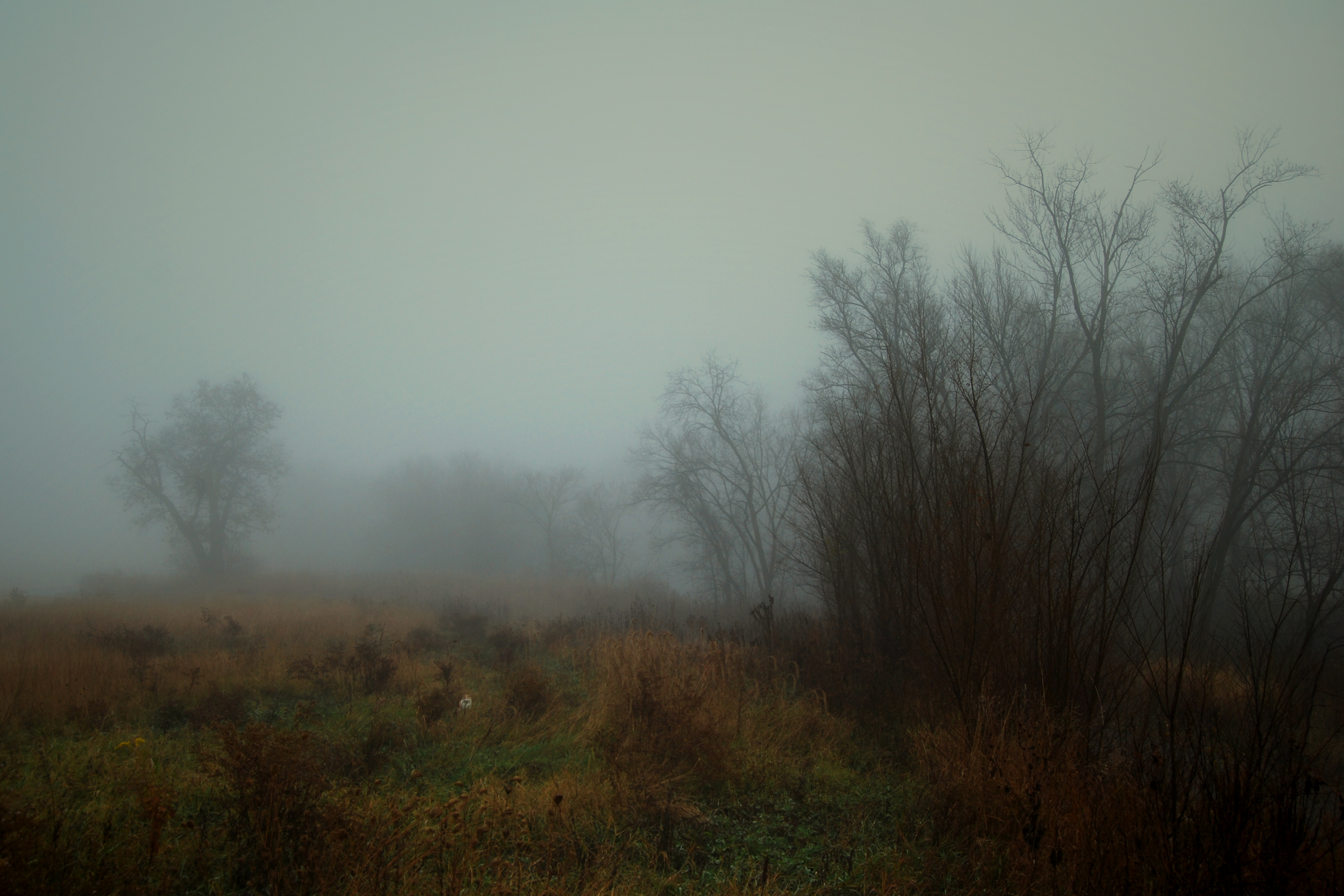
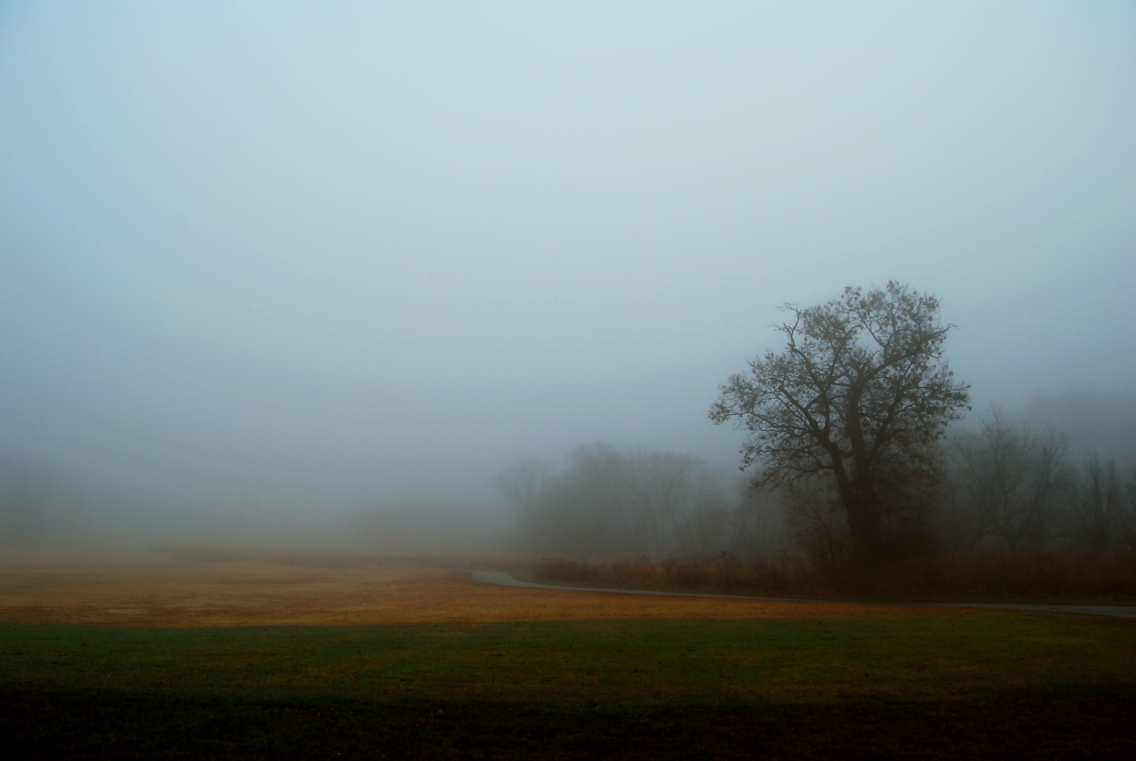
I suspect I’ll settle for one of these four covers. Years ago I learned to be able to let go of a manuscript; now I have to learn to do the same with a book cover.
But this shit ain’t easy.