I noodled around the Des Moines Art Center with some friends a couple of days ago. It had been a while since I’d visited the art center, and I’d forgotten just how visually engaging its architecture is. I’d brought a camera (a real, actual, no-nonsense camera), thinking I might shoot some photos of the artwork. And I did. I shot three frames with the camera — all of the same Calder mobile. I spent far more time shooting quick black-and-white snaps on my cellphone. And very little of that was of the artwork; almost all of the photos I shot were about the building.
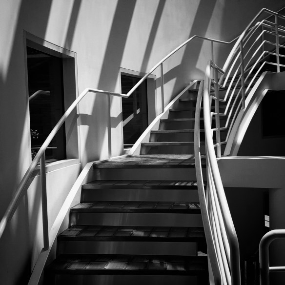
Stairs in the Meier wing
The history of the architecture of the Des Moines Art Center is sort of interesting. Well, it’s interesting to me. The original design was the Finnish architect Eliel Saarinen. He’d won a competition in 1939 to design the Smithsonian Gallery of Art. But Congress being Congress, they decided to deny funding for the construction. Happily, the folks in charge of creating a new art museum in Des Moines saw Saarinen’s plans for the Smithsonian and said, “Dude, slide on over here and build us a museum.” And he did. He cobbled together a structure that was an esoteric combination of Art Deco and Art Nouveau styles. They finished construction in 1948.
What made it unique, though, was the decision NOT to construct a standard museum gallery. Saarinen’s design also included spaces for practice and instruction, making it both an art gallery and a teaching center. And hey, bingo — we had us an art center. Pretty cool idea.
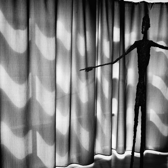
Sunlight through a curtain (with incidental Giacometti bronze)
In the late 1960s, the art center folks decided to expand the building to include a space large enough to hold an auditorium and display really big sculptures. They got I.M. Pei to design it. It’s hard to do better than Pei. But his design revolved around a sort of massive block building that would tower over the existing structure. It was necessary, of course, but the design would have clashed with the low, ground-hugging Saarinen design. So Pei said, “Dudes, not to worry. I’ll sink the block into the landscape, easy peasy, lemon breezy.” And hey, bingo — we had us a fine addition to the art center.
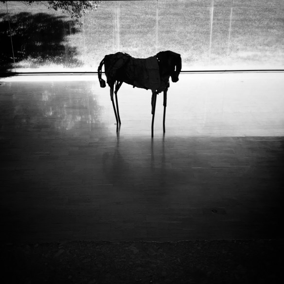
I.M. Pei window (with incidental Debora Butterfield painted steel horse)
By the 1980s, the art center needed another new extension — a space to house more contemporary works. This time they landed Richard Meier as the architect. Meier is one of those Pritzker Prize geniuses whose work is fairly idiosyncratic. The guy is totally smitten by structures designed around very white geometric patterns. Nothing at all like the designs of Pei or Saarinen. The advantage of being a Pritzker genius is nobody’s going to force you to adapt your aesthetic to fit in with your predecessors.
Meier’s addition to the art center is basically what he’s known for — white geometric patterns. It sort of looks like it was designed by a member of the Borg Collective who’d gone to an architecture school in Minecraft. That sounds more harsh than I mean it to. It’s really a very smart, clever, and very very clean design. Just different from the rest of the art center. But hey, bingo — we have us a space for contemporary artwork.
It speaks to the design, I think, that the only time I felt the need to shoot a photograph in color was in the Meier wing.
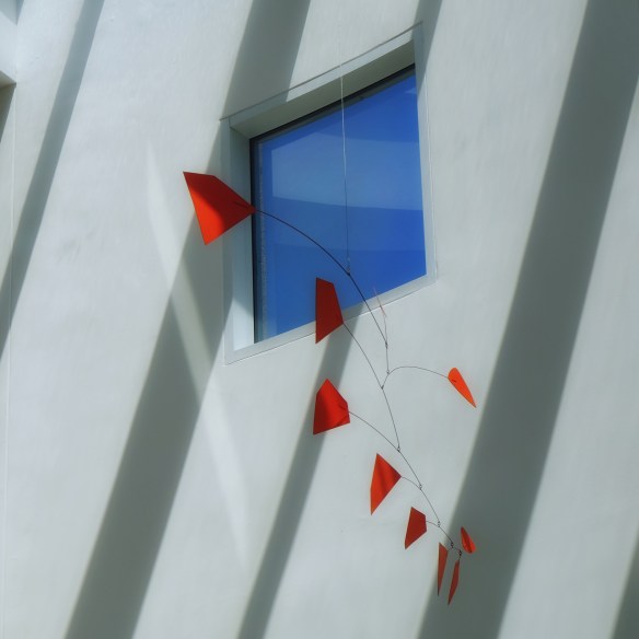
Mobile — Calder, Meier wing.
The fact is, I really didn’t make any thoughtful, considered photographs. I just walked around and took quick, square format, b&w snapshots using an app I’ve configured for black-and-white photography. It wasn’t until I got home and looked at the photos (there were only 18 of them) that I realized most of the photos were of the building itself rather than the art it houses. Art figured into some of the photos, but they were accents incidental to the photo rather than the subject of it. If that makes sense.
It wasn’t that I didn’t enjoy the art; I did. I enjoyed it a lot. In fact, I’d often put on my glasses and get really close and try to figure out exactly how some of the work was done. I mean, how did George Wesley Bellows manage to paint a human face (it is, I’ve decided, humanly impossible — maybe Bellows was an alien)? I looked at the sculptures and admired the sketches and appreciated the paintings and watched a couple of works of video art. By the way, some of the video art? Incomprehensible and (is there a polite way to say ‘stupid’? — no, I don’t think there is) stupid. But then there was this piece by Michael Najjar. Sublime.
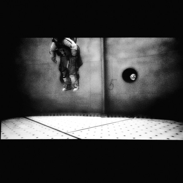
Spacewalk — Michael Najjar
I looked at just about everything and I enjoyed most of it, but in the end the primary reason I’d shoot a photograph had most to do with the way the building interacted with the light. The way the light and the structure worked together seemed to infuse some sort of extra meaning to both. For example, I was very much taken by a chair (based on an Eames design) partly because I mistakenly thought I was in the Saarinen wing (the Eames brothers were students of Saarinen). I was actually in the Pei wing — irony gone awry.
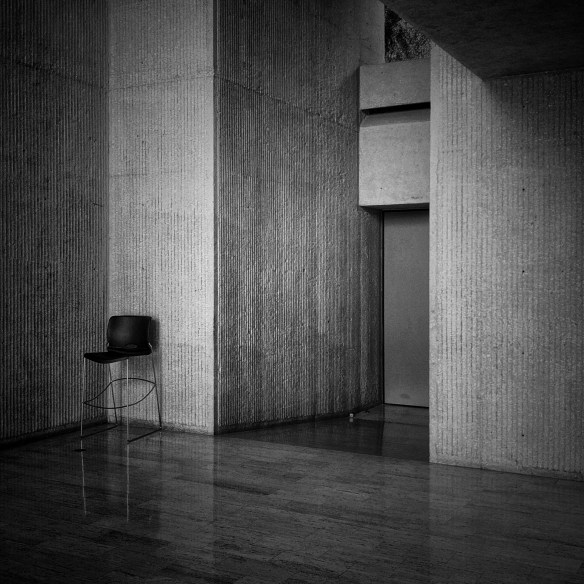
Unironic Eames chair
Some of these photographs, I know, probably won’t appeal to anybody but me. Like the chair above. It’s just a chair the guards sit in. Or this view out a window to the street. What’s that about? There was something about the geometry that appealed to me, though I couldn’t say what.
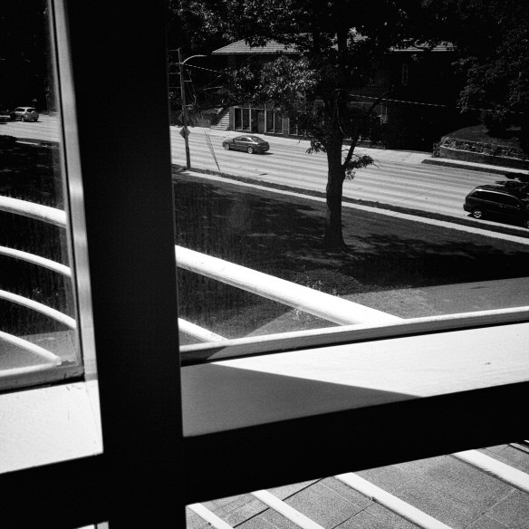
Looking out on Grand
I actually spent more time on this stupid photograph than all the others combined. I wanted to get that tree in the right spot, and the reflection of the window’s crossbar just the right angle. Then I probably stood there, trying to be still and hold that view, for a couple of minutes, waiting for the passing cars to line up properly. Silly, I know, but it seemed worth it at the moment. Still does.
It’s a wee bit embarrassing to visit the art center and return home with nothing but a handful of black-and-white photographs. All that amazing art, and here’s me with some photos of curtains and stairways and chairs and random views out of windows.
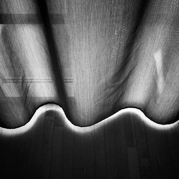
Some random curtain
But what can you do? That’s where the light was.