Back in May of 2024 I read an article that suggested photographers could benefit from looking at their old photos as if they were made by a different person. At the time, I was skeptical about the idea, but what the hell…I did it anyway. And here’s me doing it again, for the 9th time.
What’s weird is the fact that I’ve never been at all interested in looking at my old photos. I understand a lot of photographers do that, but it never made much sense to me. I mean, I shot those photos; I know what they look like. I’ve already seen them; I want to see something new.
Without rereading the original post (or the original article), I can’t quite recall the actual point of this exercise. I think the idea was that by looking at one of your old photos as if some other photographer had shot it, you can learn more about yourself as a photographer. That doesn’t sound quite right, but I’m pretty sure it had something to do with dissociating yourself from your work and evaluating it. Whatever the point was, it was apparently enough for me to go rummaging through my digital archives.
Which brings me to this:
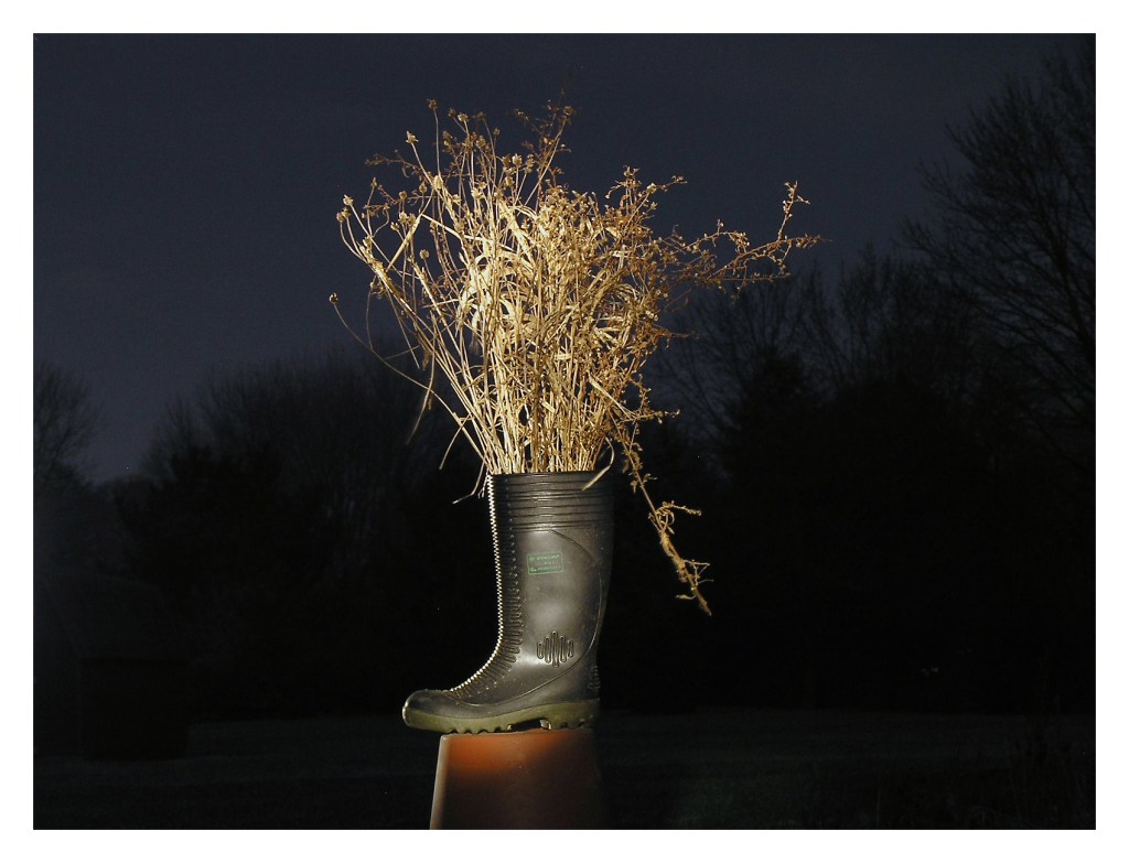
7:43 PM, Saturday, February 11, 2006
I shot this about two months after buying my first digital camera–an Olympus C770UZ. We’re talking four megapixels. I’d put away my Canon A1 a couple years earlier, bored with photography (most of the photos I’d shot in the preceding years were job-related: forensic photos of crime scenes or surveillance photos). A friend had bought one of those Olympus cameras and it looked like fun. So I bought one and started playing with it.
This photo was shot at night, a 15 second exposure, illuminated with a flashlight. It’s just one of my old arson boots, jammed full of dead grass I’d gathered during the day, and set on top of a clay flowerpot. No idea why; I must have been in a Dadaist mood. I even gave the photo a title: Vase.
You know, I’m starting to understand some of the value of looking at old photos. I was a lot more playful with photography back then. I think having a digital camera–being liberated from the expense and constraints of film–gave me more freedom to just try weird shit and immediately get a sense of whether that weird shit worked. I recall getting several friends to simultaneously throw objects into the air, which I’d then photograph. Things like footwear or toys or pieces of fruit, hovering in the air.
Now I think of it, my first foray into Instagram was a project I called Things on a Table, which had a somewhat Dadaist anti-art nonsensical vibe, and was also sparked by the purchase of new tech; in this case, a cellphone with a decent camera. Since it wasn’t a ‘real’ camera and Instagram wasn’t a ‘serious’ photo app, I could just fiddle around with them. The project involved finding a thing, putting that thing on a glass-topped patio table, then photographing the thing. I wrote about Things on a Table back in 2014.
I may have to consider doing some sort of Dadaist project. Preferably one that doesn’t require buying new tech.
The great and horrible thing about people is that they’re unpredictable; they do weird shit in ways that seem normal and normal shit that in ways that seem weird. If you’re on the street and you have a camera, you can sometimes photograph moments that are both weird and normal at the same time.
Yesterday I spent a short time at an autumn festival in a small Iowa town. It was about what you’d expect: locals and visitors milling about, some music, kids playing, adults trying to be patient with kids playing, old folks enjoying the mild chaos without having to be responsible for anybody, booths selling baked goods (I brought home a delicious apple cinnamon cream cheese coffee cake, which I’m eating as I write this), fresh local veggies, craft goods, displays by local artists, hot and cold beverages (I bought a cup of hard apple-pineapple cider that must have had an ABV of around 10%), tee shirts, decorative gourds, etc, There are usually some decent opportunities for candid photos at festivals like this.
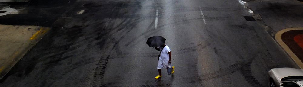
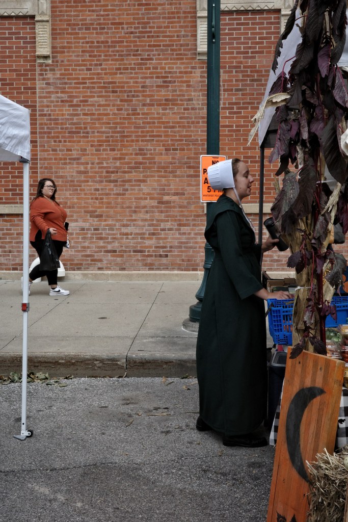
There was a young woman I assumed to be Mennonite since she wore a classic white kapp and black clothing. There are a lot of Amish and Mennonite communities in small Iowa towns, and I think it’s important as a photographer to be sensitive about both when and why you photograph them. In my opinion, it’s okay to photograph them as people, but not as specimens–if that makes sense. I think it’s also okay to photograph them as compositional elements, in much the same way you might photograph a person in a bright red bonnet or wearing yellow shoes (as in the photo at the top of this blog). But it’s NOT okay to photograph them for being different or in a way that treats their clothing as a costume. It’s NOT okay to photograph them as ‘weird’.
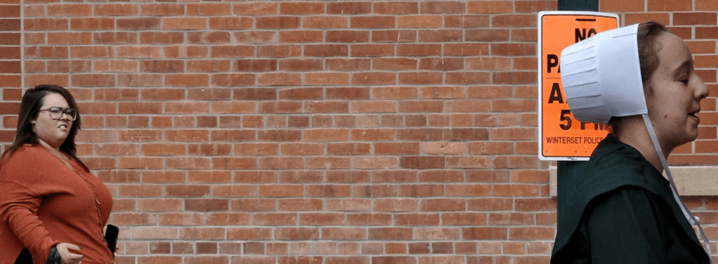
This young woman was standing beside a booth decorated in large, deep reddish-brown leaves, which made her white kapp pop out beautifully. But there was a lamp post with a ‘No Parking’ sign directly behind her, which detracted from the scene. So I started to shift position in the hope of getting a better composition. As I moved, I saw another women start to pass behind her. That lizard part of your brain that tells you to do something before your brain actually processes it took over and I snapped a quick shot as I moved. Here’s that shot.
Unfortunately, I never did get the shot I wanted; other people got in the way. But that’s what happens on the street. You either get the shot or you don’t. I moved on and didn’t give the moment another thought. Until I got home and looked at the photos.
At first glance, the quick shot of the young Mennonite woman wasn’t particularly interesting to me. If anything, it was the sort of photograph I don’t want to take…a ‘normal’ person and a ‘weird’ person. But then I noticed the expression on the face of the woman passing behind her.
I can’t quite figure out what to make of that expression. It’s disapproving, to be sure. But beyond that, I just don’t know. Is she merely displeased by the woman’s clothing/beliefs? Is she outraged, or repelled? Is she offended by the presence of the Mennonite woman or her clothing? Is she being intolerant of religious differences?
It’s entirely possible she wasn’t looking at the the young Mennonite woman at all, that she was looking at something beyond her. But I don’t think so. What is that woman thinking, what is she feeling? And why am I letting it bother me?
In any event, it occurred to me that the ‘normal’ woman in this photograph was being weird and the ‘weird’ woman was being normal. Which made the photo more interesting to me. But because I tend to overthink things, I have to wonder if a photographer feels it’s necessary to explain why a photograph is interesting…is it really interesting? I don’t know.
But I know I’m glad I took the shot. And I’m glad I wrote about it. Because now I can let it go.
EDITORIAL NOTE: Let me once again sing the praises of the Ricoh GR3X. I took this shot while moving and carrying a plastic cup 2/3 full of apple-pineapple hard cider. I was able to turn on the camera, make a quick aperture change to enlarge the depth of field, and press the shutter release, all within a quick moment and with only one hand. Never spilled a drop.
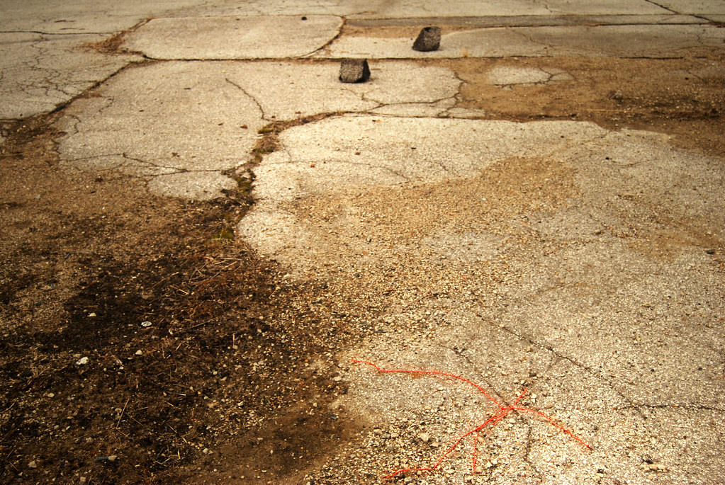
A couple of days ago I wrote about a photograph I’d taken of some cracks and oil stains in a random patch of blacktop. It may seem a wee bit weird to photograph a patch of blacktop, but…well, just wait. In that post, I briefly referred to the fact that there’s a difference between blacktop and asphalt. That sparked a reply to the post, and that reply reminded me of an earlier crushed stone and bitumen-related photograph I’d taken fifteen years ago.
Now that was weird.
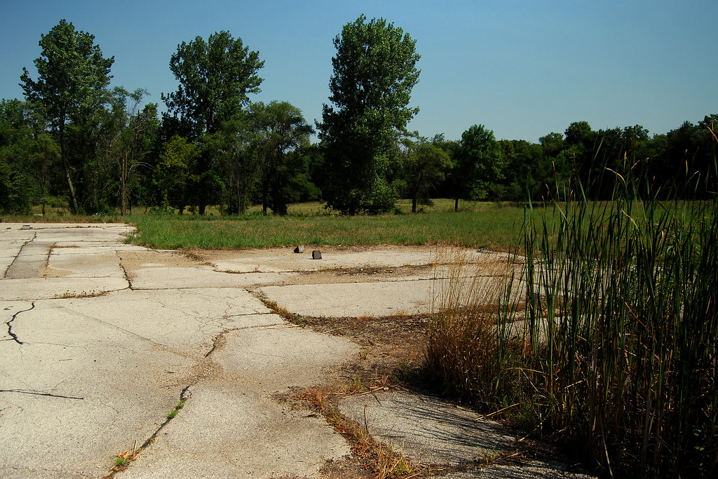
Back in November of 2010 I was noodling around a location where a local supermarket had been demolished. All that remained of the store was its foundational slab and what had once been a parking lot. That’s where I came across something odd.
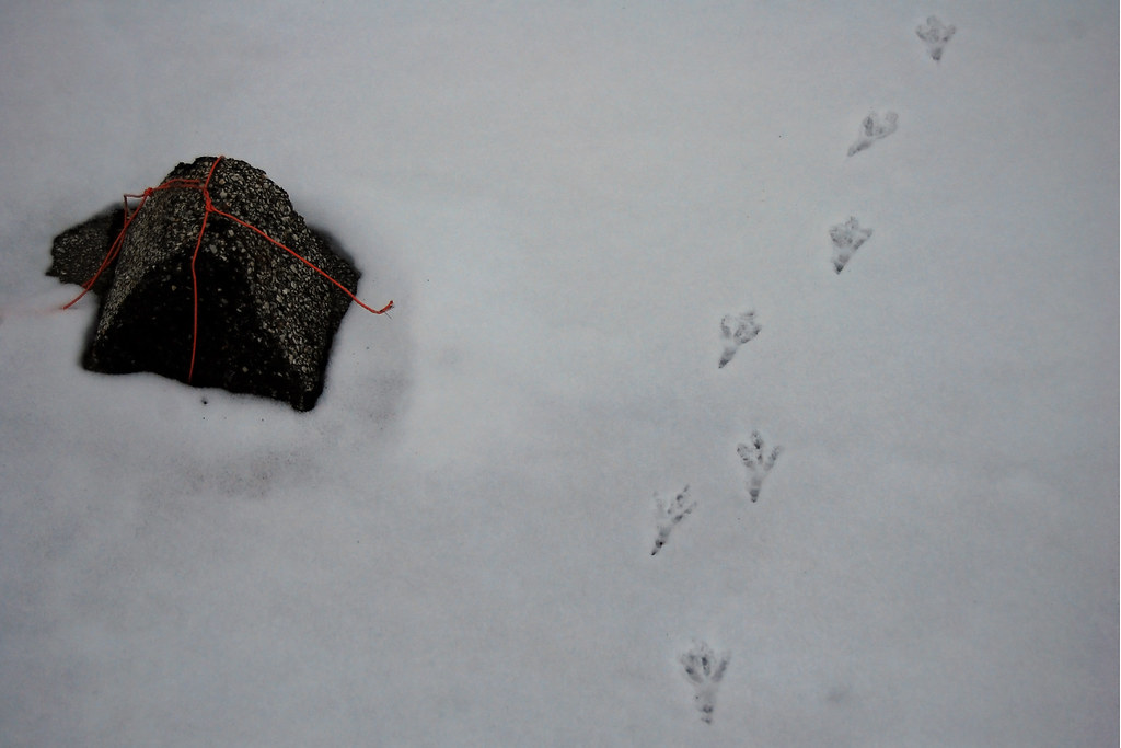
November 13, 2010
Yep, that’s a chunk of asphalt curbing around which somebody had tied a strand of red PVC-coated wire. Why would somebody do that? I don’t know, but I assumed it was to make it easier to carry. Why would somebody want to carry a chunk of asphalt curbing? No idea. I located the spot from which the curbing had been removed about 20 yards away. There were several similar chunks of broken asphalt curbing. But somebody had selected that particular chunk, tied red PVC wire around it, and moved it.
Why? No fucking clue. But it was odd, and I do love things that are odd.
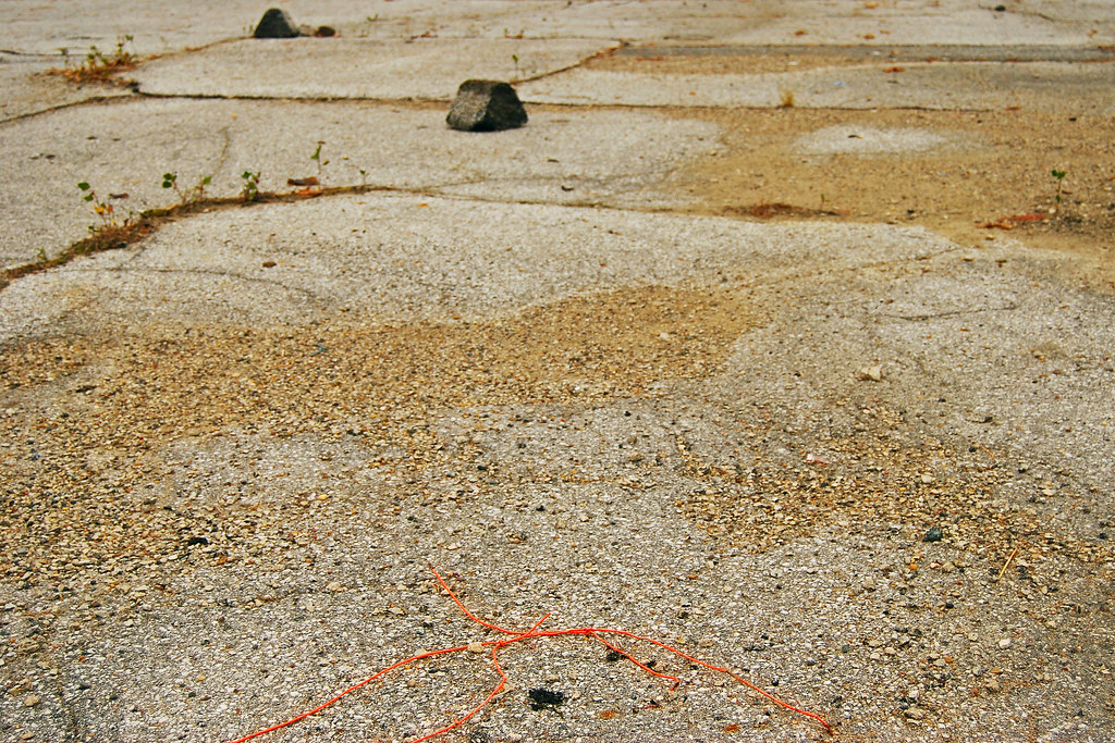
December 23, 2010
So I returned to that spot about six weeks later. The chunk of curbing was still there. It had snowed, but the snow had melted off the chunk. A heron had apparently been curious enough to check it out. Not sure if that meant the heron was as curious as I was, or if I was as stupid as a heron.
Anyway, I stood there in the snow for a while, trying to cobble together some semi-logical reason for somebody to tie some PVC wire around a chunk of curbing and carry it twenty yards before dropping it. I was sure there was a logical reason; not necessarily logical to me, but logical to the person who did it. But I’m damned if I could figure it out.
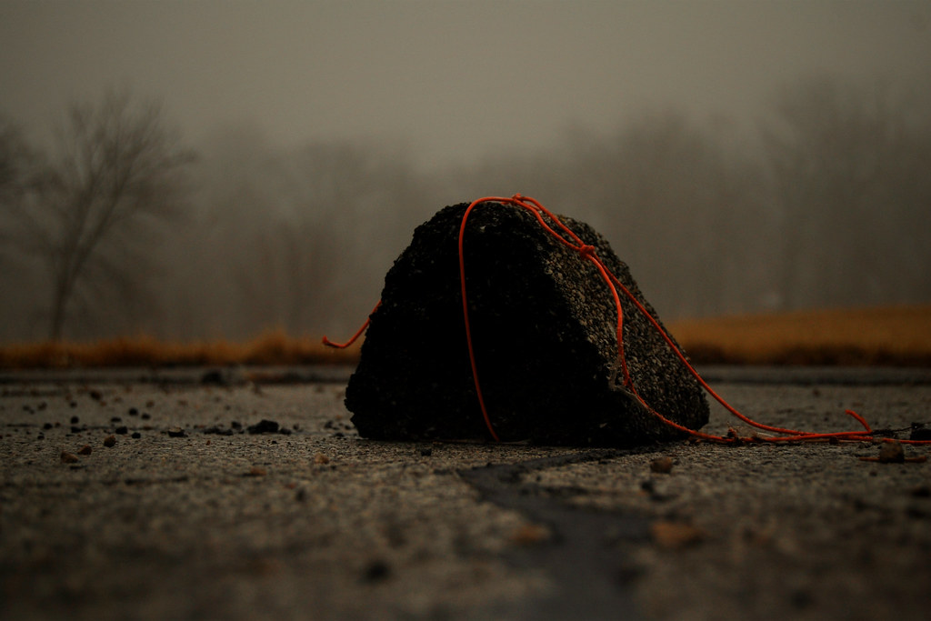
February 16, 2011
I found myself occasionally wondering about that chunk of curbing and the red PVC wire. Did the person just happen to have some red PVC wire in their pocket? Had they deliberately brought the wire with them, intending to move the chunk of curbing? And why why why would they want to move it in the first place? It made no sense, but I was intrigued by it.
So I went back again on a cold, wet, foggy day in February. And yep, it was still there.
February 16, 2011
It wasn’t just strange; it was also visually interesting. I was taken with that red PVC wire. I considered taking hold of the wire and lifting the chunk, just to see how heavy it was. But I was reluctant to disturb it. It wasn’t just an object of curiosity anymore. That’s when I began to think of the chunk of curbing as a possible photo project. Which meant it didn’t seem right to intentionally change anything about the subject matter.
April 13, 2011
I returned to visit the chunk of curbing about a month later and was shocked to see it had been moved. Somebody had apparently picked it up, carried it about twenty-five feet, at which point the red PVC wire had snapped.
I can’t imagine many people would find a reason to noodle around the detritus of a former supermarket. But IF somebody did, and IF that somebody happened upon the chunk of curbing, then surely they’d be tempted to pick it up. I mean, I’d been tempted to pick it up myself. The way the PVC wire was wrapped around the chunk of curbing–it was clearly intended for it to be picked up. Who could resist it?
Somebody didn’t resist it. Somebody had seen it, had picked it up, and toted the chunk of curbing twenty-five feet. Hell, that was the most understandable thing about the whole situation.
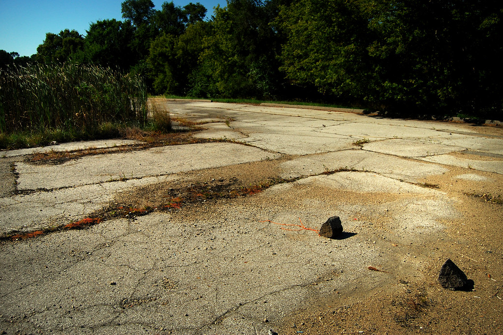
August 24, 2011
I didn’t get back to visit my pet chunk of asphalt curbing until late in the summer. As I approached, I saw two chunks. I thought maybe whomever had moved the curbing back in the spring must have returned and broken it.
But no. It was a second chunk of asphalt curbing. Somebody–maybe the same person who’d moved it earlier–had apparently gone to the spot where other chunks of curbing were scattered, picked up another chunk, carried it to the vicinity of my pet chunk, and dropped it.
This compounded the WTFedness of the situation. It reinforced the original weirdness. It made no sense at all. It was insane. It was…kind of wonderful. I was oddly pleased by the development.
September 8, 2011
I returned a month later. Not much had changed. Some orangish lichen had grown in a nearby crack and I spent some time trying to find a way to photograph the red PVC wire and the orange lichen, but nothing seemed to work. In the end, I just documented my chunk of asphalt curbing along with its companion.
I figured I’d just about come to the end of the chunk’s story. I was still curious about the whole thing, but the original aura weirdness was beginning to fade.
October 18, 2011
Still, I’d developed something of a perverse relationship with that chunk of curbing. I felt a need to check on it. So of course I went back.
The red PVC wire had moved. It had broken six months earlier, but a length of it had been trapped beneath the chunk of curbing. How did it get loose? Maybe a bird or animal had tugged on the wire and freed it? In any event, I took it as a sign (No, not that sort of sign; just an ordinary sign) that the project was at an end. Surely, the wire would soon get blown away. Without the red PVC wire, the chunk of curbing was just a chunk of curbing. As soon as it was gone, the photo project would be over.
December 20, 2011
I gave it a couple of months. I went back in December. Nothing had changed. As near as I could tell, the red PVC wire hadn’t even moved. That was…weird. You’d think that over the course of two months something would have moved the wire. But that was just minor league weird compared to the overall weirdness.
Still, I’d made the decision that I’d keep coming back until the red wire was gone. So I returned in the spring. The entire area was fenced off and construction equipment was tearing up the old parking lot.
There’s an apartment complex there now.
I no longer live in that area, but maybe once or twice a year there’ll be a reason for me to pass nearby. And when I do, I think about that chunk of asphalt curbing, and the bright red PVC-insulated wire, and the person who’d tied the wire into a parcel-carrier. And I wonder what in the hell they’d been doing, and why. And it pleases me that I’ll never know the answer.
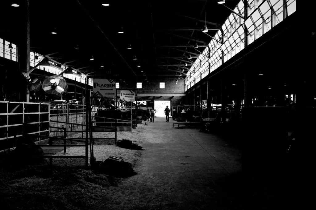
The Iowa State Fair…well, every fair, really…is a colorful event. Bright, garish colors. Not normally a venue I’d consider photographing in black-and-white. And, in fact, of the maybe 150 photos I shot during my five hours of noodling around the fairgrounds yesterday, only a few were shot in monochrome.
Guy in an almost empty barn.
Why would I do that? Because there are some scenes that feel like they ought to be shot in monochrome. Color photography is my default approach, and sure, you can shoot scenes in color and convert them into black-and-white images (which is actually the best approach, since digital imagery is grounded in information rather than color). But if there’s something I want to shoot in black-and-white…well, I shoot it in black-and-white. I want to see it in black-and-white.
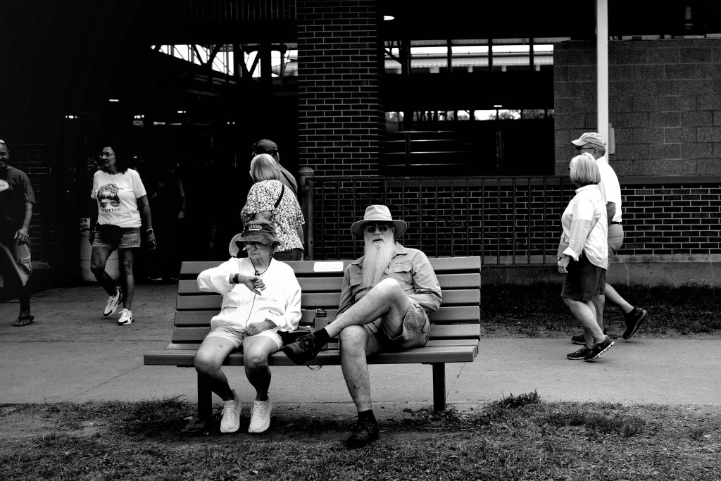
Bearded guy.
Obviously, we live in a world of color (well, most of us do) and yay for that. I love color. But sometimes it’s a distraction. The photograph above is all about the beard. But this guy’s clothing was a drab sort of khaki which made his beard almost disappear. Worse, the woman next to him was dressed in bright colors. In fact, most of the passers-by were dressed fairly colorfully. The only way this photo would work was if I removed the distractions of color.
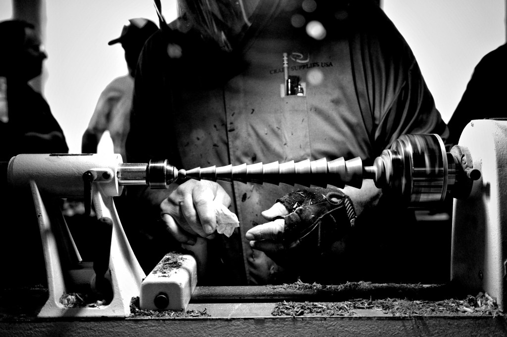
That’s one of the many advantages of digital photography. Almost every modern digital camera allows you to quickly shift back and forth between color and monochrome. I have my Ricoh GR3X set up with two different color profiles and a high contrast monochrome profile. When I saw this guy demonstrating wood-turning on a small lathe, I knew his brown-green smock would interfere with the color of the wood. A turn of a dial, and problem solved.
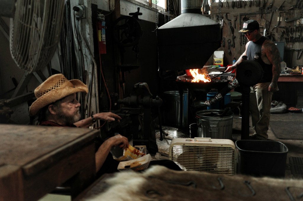
But what do you do when there are scenes that work in monochrome AND color? For example, a blacksmith at work. You can’t ignore the bright color of flame, or the way fire casts a glow on the surroundings. Obviously, you have to shoot both. Each carries a different emotional weight.
Blacksmith at work.
The photograph above is, I think, a very human photo. It’s as much…or more…about the people in the photo as it is about blacksmithing. The light cast by the flame and the high windows softens everything. It gives the image an almost cozy feeling.
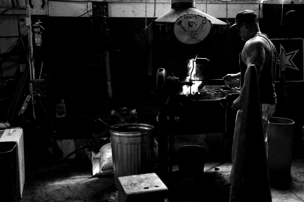
When you remove the distractions of color, the mood changes. It’s not just that the composition becomes more focused on tone and texture, on shadow and light, or line and form. Removing color also means abandoning the strictures of reality. Black-and-white photos are a wee bit divorced from reality, a step or two away from the real world, recognizable but still different. This can give an image an almost mythic quality.
Blacksmith at work.
This photo is less personal, more emotionally distant, more analytic. It’s not about the guy doing the work; it’s more about the mythos of blacksmithing–the narrative of the smithy, the cultural representation of blacksmithing. It has a more primitive vibe. Where the color photo is about warmth, this is about heat and fire.
Also? Black-and-white photography encourages a LOT more artsy-fartsy bullshit.
Late last night I was noodling about on YouTube, looking for something about Japanese photographer Miyako Ishiuchi (who, by the way, is vastly underappreciated) and I came across a video by–I guess he’d be considered an ‘influencer’? I’m not going to mention names; he’s a good photographer, makes a LOT of videos about photography and photo gear, he’s got a large following. This particular video was focused on his feelings about being burnt out. He said:
“Lately I’ve been feeling like my photography hasn’t been saying what I want to say. I’ve been questioning if it’s even the right medium for me to communicate my thoughts and feelings.”
Okay, valid. And hey, he’s right. Still photography isn’t a very effective medium for expressing thoughts and feelings. Writing is a good medium for communicating thoughts and feelings. Cinematography–moving images–another good medium for communicating thoughts and feelings. A cohesive series of purposely related still images can be an effective medium for communicating thoughts and feelings.
But a single photograph? Nope.
A single photograph is useless for expressing thoughts and it’s unreliable as a tool for expressing something as complex as feelings. A single photo can certainly invoke a mood, and that mood might suggest something of what the photographer was feeling. But it might not. A happy photographer can shoot a grim, moody photo; a photographer in deep despair can still shoot a cheerful photograph. A single photo, regardless of how powerful it is, is just a moment isolated in time and limited by an artificial frame.
As to thoughts, you often hear people say stuff like, “This photo tells a story.” No. No, it doesn’t. A single photo doesn’t tell a story. It can’t tell a story. A story has a beginning, a middle, and an ending; you need at least three photographs to tell a story.
BUT a single photograph can hint at a story. It can imply a story. The viewer, looking at a single photo, can create a story based on that moment. But it’s the viewer’s story; it comes from the viewer. It’s only inspired by the photo. A single photo can be the beginning, the middle, or the ending of a story. But an entire story? Nope.
This is not a story. It could be part of a story, but it’s not, in itself, a story.
That said, still photography can be a powerful story-telling tool IF you string together a series of related photographs. Photo-stories can even be more powerful than video, because you can take your time looking at a still photo. You can examine every corner of the frame. You have time to blink and think and ponder what you’re seeing in each image, instead of simply responding to the images streaming in front of you.
The photographer in the video also said this:
“I feel like a good photograph is something that expresses what the creator wanted to say.”
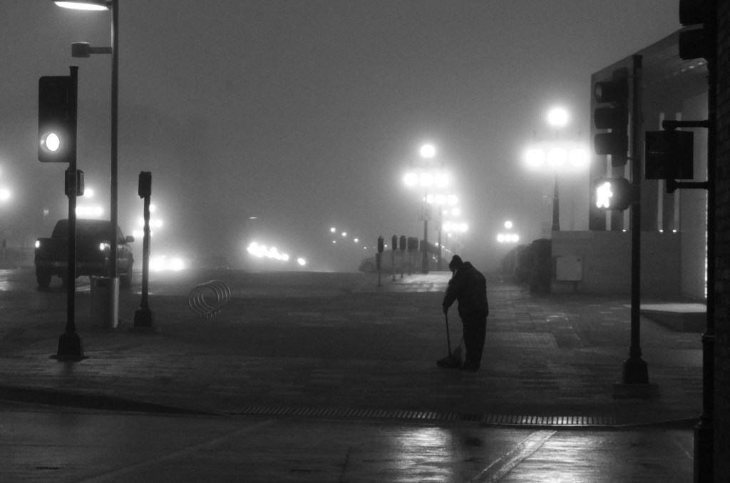
I dunno, maybe? If you want to say something like “Ducks are cool” or “Tall buildings are impressive” or “Look at this guy cleaning up street trash on a cold, wet, foggy morning,” then yeah, a good photo can express what you want to say. But if you want to express anything more complex than a simple declarative sentence, then your hope that a photograph will express what you want to say is…well, misplaced.
The only thing I was trying to say was, ‘Seeing this guy at work makes me feel something.’
Another thing—at no point in his video did the guy ever articulate WHAT he wanted to say. Or why he wanted to say it. Or how his photography was falling short. In fact, he said,
“I sometimes feel like I don’t have anything to say…and that I’m just making photos.”
Dude, that’s fine. Ain’t nothing wrong with just making photos. But when you deliberately take a photograph, regardless of the subject, you ARE saying something. You’re saying, “This is what I see. This is how I see it. What’s happening in front of my camera is interesting to me. It makes me feel a certain way. Maybe it’ll have a similar effect on you.” The impulse to press the shutter release is, by itself, a valid reason to take a photo.
I found this guy’s video annoying. Annoying and ironic. The irony is that the guy who was complaining that still photography failed to communicate his thoughts and feelings was actually communicating his thoughts and feelings using a medium designed to communicate thoughts and feelings.
My point is this: any expressive medium–still photography, cinema, writing, dance, painting, acting, sculpture–is limited. Don’t ask more from any expressive medium than it can give you. And don’t whine about the limitations.
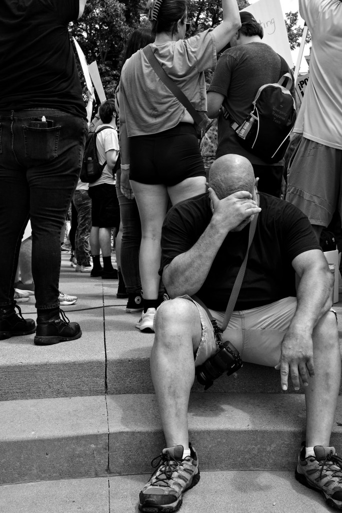
I posted this photograph on Bluesky a couple of days ago. I almost didn’t take it.
I was noodling around the edges of a demonstration and saw this guy, overcome with emotion (and maybe the heat), turn away and sit down. He was a big guy, bald, looked strong; not gym-strong, but work-strong. The anguish on his face was hard to look at but strangely beautiful. It was probably a moment he’d rather not have in public…but he did.
Overcome.
Okay, let me just get this out of the way: in the US you have no right to privacy when you’re in a public space. That’s the law. If you’re in public, other people have the right to take your photograph. The question is never whether it’s legal to take another person’s photo; the question is always whether it’s ethical or appropriate. Those are individual decisions and only the photographer gets to make them.
I wanted to take that guy’s photo. But I didn’t. It seemed too private, too personal. Then he put his hand up and covered his face. The depth of his emotion was still clear from his body language, but by covering his face the image became less about him as a person and more about the emotion itself. So I took one shot and moved on.
I don’t shoot a lot of photographs of people. When I do, it’s most often during a public event. A farmer’s market, a street fair, a protest march, a sporting event, that sort of thing. Sometimes I’ll shoot people in more generic public venues–at a fruit stand, in a pub, on a bicycle ride. I may or may not ask permission to take their photo; it depends on the situation and the moment. I’m very open about carrying my camera in circumstances like this; I’m not trying to conceal what I’m doing, but at the same time I don’t try to draw attention to myself.
“Oh? You want a photo?”
Occasionally I’ll see somebody who, for one reason or another, interests me and I’ll stop them and ask if I can take their photo. Occasionally, they’ll say no; sometimes because they’re in a hurry, sometimes because they’re shy, sometimes for reasons they don’t articulate. If they say no, I just thank them and go on my way.
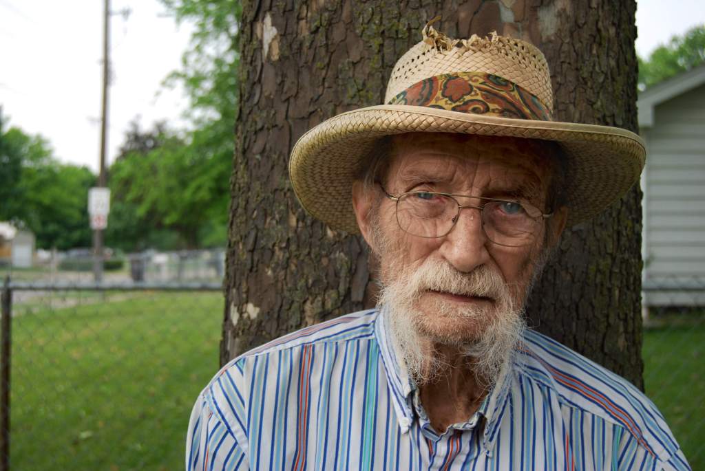
But most people say yes. Like this guy, John, who was waiting for a bus. Most people are friendly. They may ask, “Why do you want to take my picture?” and if they do, I tell them. I told John I liked his mustache and his hat. I don’t always ask their name, but I always thank them and show them the photo. Nobody has ever asked me to delete their photo.
John, waiting for the bus.
I DO NOT take photos of marginalized people in states of distress. I confess, I’m occasionally tempted to shoot those sorts of photos. Suffering is part of the human condition, after all, and I think if it’s done with compassion, such photos can have merit. But they can also just be cheap exploitation. And frankly, the viewer can’t know the photographer’s purpose by looking at the photo. The photo is what it is.
Having just said that I don’t take photos of folks experiencing hardship, I’m now going to admit I actually DID take one a couple of weeks ago. I was walking down a city street and came across a man who was stumbling along, leaning against a containment wall of a landscaped office building. As I got closer it became clear he was extremely intoxicated. I asked him if he was okay. He kind of wobbled his head; I couldn’t tell if he was shaking his head ‘no’ or if he was nodding. He said, “I just need to lay down for a bit, I just need to rest, to sleep.” He said that two or three times.
And he did just that. He climbed up on the containment wall, laid his head on his arm, and closed his eyes. I don’t know if he went to sleep or if he just passed out. I stood there for a very long moment, uncomfortable about leaving him and equally uncomfortable about staying with him. The look of misery and exhaustion never left his face. But there was something almost delicate about his relaxed hands.
I very much wanted to photograph him. And I was ashamed of wanting that. In the end, after a minute or so, I took the photo and left. Was it an ethical violation of his privacy in moment of vulnerability? Yes, without a doubt. But I did it anyway.
It’s a good photograph. Not a great one, but good. t’s an honest one. I like it and I hate it. I haven’t shown it to anybody. I discussed the entire incident with my partner and told her about the photo; she was rightly troubled by my behavior. So am I.
Iron Photographer, qu’est-ce que c’est? Think Iron Chef…only with photography. Iron Chef, if you’re not familiar with it, was probably the original televised cooking competition. Starting back in the 1990s, the show required contestants to improvise a multi-course meal around a surprise theme ingredient–asparagus, for example, or eel, or peaches. The chefs had to be creative and resourceful.
Back in 2006, at the dawn of the digital photography era, in a Flickr group called Utata, we decided to purloin that concept and apply it to photography. Instead of a theme ingredient, Jamelah Vincent (@jamelah.bsky.social) and I provided three photographic elements and challenged our group members to use them to create an artful photograph. After more than 250 Iron Photographer challenges, we retired the project.
1) Something round, 2) a reflection, 3) black-and-white – Greg
Now we’re bringing Iron Photographer back on Bluesky. On the 1st and 15th day of each month, we’ll post the three elements of a new IP challenge.
Unlike the Iron Chef model, Iron Photographer is NOT a competition. There are no winners, no losers, no judges. It’s simply a challenge; an invitation to stretch your imagination and creative skills.
Usually (but not always) the challenge is comprised of two compositional elements and one artistic element. For example, 1) something with stripes, 2) a food item, 3) shot slightly out of focus. The challenge is to find a way to photograph those three elements in an expressive way. It doesn’t have to be Art; but it should be artful, if that makes sense.
1) something with stripes, 2) a food item, 3) shot slightly out of focus – Greg
Every photographer interprets the compositional elements for themselves. You decide on the food item (I chose an apple; you might choose an egg, or a chuck roast, or some tofu, or a handful of chia seeds), you decide on the thing with stripes (I picked a shirt; you might choose a lawn chair, or a beach towel, or a tabby cat). The compositional elements are usually broad and expansive enough to provide the photographer with lots of options. You can almost always find–and photograph–the IP elements in your home or apartment.
The artistic element, on the other hand, is meant to be fixed, though it’s often flexible. You decide what “slightly out of focus” means, but the shot MUST be slightly out of focus. If the third element is ‘Dutch angle,’ you decide HOW tilted the frame should be. On the other hand, if the artistic element is ‘square format’ then the format has to be square. Not squarish; square.
Jamelah note: Sometimes you just rip off Greg’s idea because you can’t help yourself.
1) something with stripes, 2) a food item, 3) shot slightly out of focus – Jamelah
That’s basically it. That’s all there is to it. Iron Photographer is really that simple. And really that complex and convoluted, because while the photograph has to feature the selected compositional elements, it’s not limited to those elements.
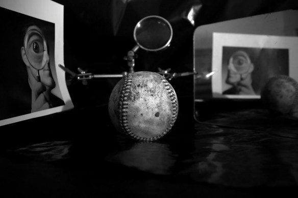
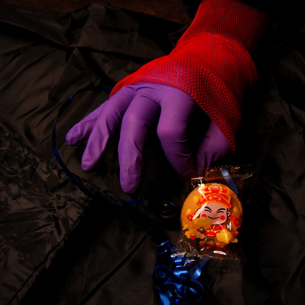
For example, in the photograph below the three elements are: 1) a plastic bag, 2) the color red, 3) shot in square format. Again, the only concrete element is the square format. You decide what constitutes a plastic bag and you decide on the red thing, but you can also include any elements you think might contribute to the photo.
1) a plastic bag, 2) the color red, 3) square format – Greg
I chose a weirdly racist plastic wrapper of a fortune cookie. Is that really a bag? I say it has enough ‘bagness’ to qualify. You may disagree. For the red element, I used some mesh that held some apples from the fruit market. But the purple latex glove? The bit of blue ribbon? I included that stuff simply because it pleased me.
I found Iron Photographer to be a creative Get Out of Jail Free card. You can do whatever you want. It doesn’t have to make sense.
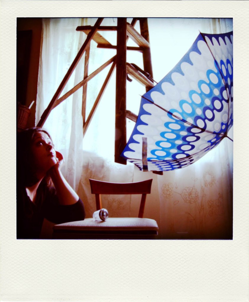
1) Self portrait, 2) umbrella, 3) in a bathroom – Jamelah
Let me repeat that: it doesn’t have to make sense. That, to me, has always been the most wonderful thing about Iron Photographer. There’s NO LOGICAL REASON FOR THESE PHOTOGRAPHS TO EXIST. There’s absolutely no earthly reason for Jamelah to balance herself on the side of a bathtub with an umbrella–except for Iron Photographer. If you participate in this gig, you WILL take photographs nobody has ever taken before. Guaranteed.
Jamelah Note:One thing about Iron Photographer, aside from the other things, is that if you let it, it’ll push you to try things that don’t seem like a great idea, but you just want to see — maybe I could do this? For example, I tied a ladder to the ceiling because I wondered if I could tie a ladder to the ceiling. When the elements for this particular challenge — 1) an umbrella, 2) a chair, and 3) Polaroid-ish — came together, I immediately started thinking about umbrellas open indoors and bad luck and then I spent an afternoon using jute twine to tie a pretty damn heavy wooden step ladder to some plant hooks in my living room ceiling and wound up with this. As I like to say, stand back. I’m being weird.
1) an umbrella, 2) a chair, and 3) Polaroid-ish – Jamelah
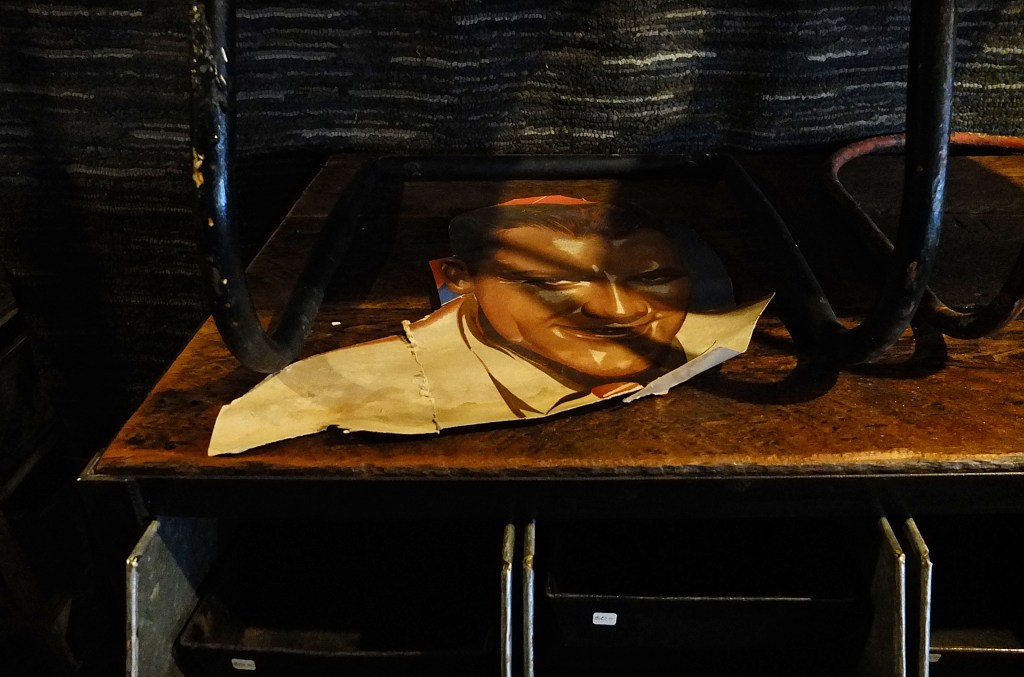
You’ll also find yourself thinking about the elements. How do you interpret them? How can you combine them in an artful way? A table, something tough, weird shadows. A table is a table, and shadows are shadows…but what does ‘something tough’ mean? What is tough? An old boot, sure. Maybe a 3000 piece jigsaw puzzle. Or a musical score that’s difficult to play. What about a piece of an old movie poster with legendary tough guy Jimmy Cagney? YOU get to define ‘tough.’
1) something tough, 2) a table, 3) weird shadows
Iron Photographer encourages you to try new and weird things. It prompts you to find creative ways to combine disparate photographic elements that may not appear to go together. It gives you permission to try crazy shit. Iron Photographer is less about taking photographs than making photographs.
And best of all, photographers at any skill level can participate. Beginners, advanced amateurs, professionals, it doesn’t matter; all you need is some imagination and a camera.
Jamelah Note: Iron Photographer offers an opportunity to learn new techniques and figure out how to make them work. Never tried noir or processing in sepia or cinematic aspect ratio or lightpainting? Iron Photographer will give you a chance.
I’ve had my Ricoh GR3x for a wee bit more than five months now. Long enough to be pretty familiar with it. Long enough, in fact, to get cocky with it. It’s SO fucking GOOD for shooting quickly and intuitively. So good that I’m starting to get sloppy with composition.
I’m usually pretty deliberate when I shoot photos. I know what I want in the frame, and I know what I don’t want. I’m usually conscious of where I should be standing in order to get the image I want. I’m usually patient. Usually. But I’m so comfortable with this new camera that I’m becoming less disciplined. Sometimes that’s good. Sometimes…not so much.
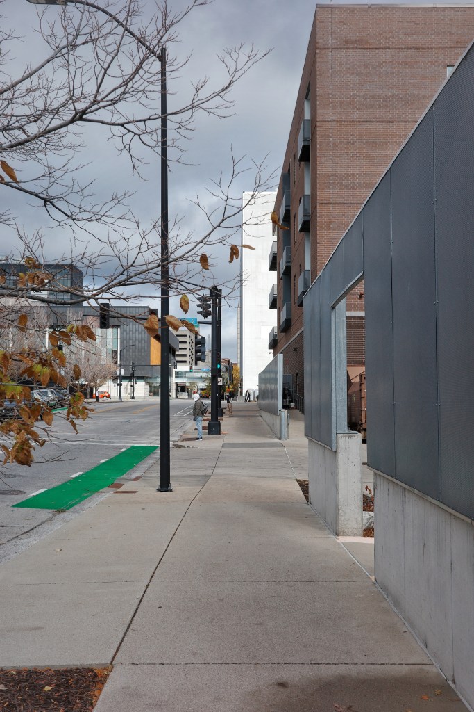
Here’s an example. I was walking down the street on a grey, sullen day when a burst of sunshine broke through the cloud cover, briefly illuminating a white building. I was immediately taken by the light and all of those lovely vertical lines. There was a sweet green patch of bike lane, some dead brown leaves still clinging to a tree, a guy in a hoodie waiting at the crosswalk. There was a wet patch on the sidewalk where a recycling bin had probably been sitting, and it mirrored the patch of turf in which the tree had been planted.
There were a LOT of elements and shapes all working together. So the Ricoh came out of my pocket, and I glanced at the screen, and took a snap as I walked. I mean, I didn’t even pause.
I chimped a quick look at the image without missing a step, and lawdy, I was so smug. Not so much with the image itself (it’s not a great photo) as with the way I shot it–on the move. It wasn’t until I got home and downloaded it that I realized I’d fucked up.
Cut off the top of the light pole.
It’s not a huge deal, partly because, as I said, it’s not a great photo to begin with. But it’s a reminder that speed and convenience aren’t always benefits. If I’d paused for a moment…if I’d taken a half step backward…if I’d followed one of the very basic rules of composition (check the edges of the goddamned frame), it…well, it still wouldn’t be a great photograph, but it would have been a properly composed one. I tell myself, “Self, if I’d paused I might have lost the light!” Which is true. But it’s also true that I wasn’t concerned with the light any more than I was concerned about the composition. I was only thinking about how cool it was to be able shoot that quickly and with such confidence. The confidence was misplaced.
Lesson learned.
(Maybe. Some lessons need to be learned repeatedly.)