yes, I watched civil war and have thoughts

Okay, first? There be SPOILERS here. If you want to see the Alex Garland film Civil War with innocent eyes, then DON’T READ THIS.

Second, Civil War is NOT a movie about how the United States split up into various factions. In fact, you can basically ignore the underlying premise of the story. It’s just not very important. Well, it’s not important to the story. Sure, it’s weird as fuck that California and Texas have somehow joined together to overthrow the fascist government of the United States (and even weirder that–and I swear I’m NOT making this up–they are supported by the armed forces of Florida), but none of that really matters. It could have been Wakanda and Ruritania teaming up to fight against Fredonia and the story would be the same.

Because this is a movie about two journalists and two news photographers covering a story. That’s basically it. They don’t take any moral or political stance; they’re simply documenting and reporting what they see. And what they see is pretty fucking awful.

It’s also a sort of road movie. Instead of a traditional plot, this movie is a series of related vignettes. As the four make their way from New York City to Washington, DC, they encounter a series of deeply localized situations. Here’s a gas station controlled by a few guys who maybe belong to some sort of community militia, there’s a town where life goes on without any apparent awareness that a civil war is taking place (until you notice the snipers on a rooftop), and over there are some uniformed sociopaths quietly filling a mass grave.

Obviously, the four characters are affected by these scenarios. The two journalists–one a sort of adrenaline junkie, the other an older obese man at the end of his career–are an important part of the story, but they’re essentially supporting roles. The ‘stars’ of the movie are the photographers. The journalists just have to observe and report; the photographers have to get the photos, which requires them to expose themselves to the action.

This was the aspect of the film I was most interested in. Unlike a lot of movies in which an actor pretends to be a photographer, Kirsten Dunst and Cailee Spaeny clearly knew how to hold a camera. While I’m skeptical that a photographer–even a rookie–would rely on a 1980s-era Nikon FE2 film camera (without a motor drive, no less) in a modern combat situation, I wasn’t particularly troubled by it. After all, the FE2 was Don McCullin’s camera of choice in Vietnam, so I assume that choice was no accident. Kirsten Dunst’s more modern Sony A7 camera bodies made a lot more sense, although I’m not convinced an experienced conflict photographer would be running around during close quarters combat toting a camera with a massive and highly visible 70-200mm zoom lens.

But overall, both actors looked natural using their cameras. There was no sense that the cameras were just being treated as props. And I have to say, I got a kick out of the fact that Kirsten Dunst (like me) has a dominant left eye–which is sort of inconvenient for a photographer.

I was especially pleased when the film referenced Lee Miller, one of the pioneering women photojournalists during World War 2. And doubly pleased by a brief early scene that was (intentionally, I hope) a callback to Miller. The scene shows Kirsten Dunst in a bathtub, which I found was reminiscent of the famous photograph of Lee Miller sitting in Hitler’s bathtub on the day he committed suicide.

My only real complaint about the film is that the climactic scene was predictable–and frankly, that’s a pretty small complaint. Fairly early in the story, Jessie (the rookie) asks Lee (the veteran) if she’d photograph Jessie’s body if she was killed in action. Lee responds, “What do you think?” (or words to that effect). At that point, it was clear that one of them would be killed and the other would shoot the photograph. It could have played out either way, but it seemed more likely there’d be a sort of ‘passing the torch’ moment in which the rookie becomes the veteran. It’s a seriously stupid scene. Jessie exposes herself to gunfire and Lee, instead of tackling her and removing both of them as a target, stands in front of Jessie, facing her (her back to the gunfire). It makes for a nice photo of Lee’s face as she’s being killed, but is still stupid.

However, the final shot of the film–the shot on the screen as the credits roll–is perfect. In the final scene, Jessie photographs some troops summarily executing the president. It’s a very matter-of-fact scene, not particularly dramatic. As the credits roll, though, we see the shot taken after the execution. It’s depicted as if the image is very slowly being developed in a darkroom–the gradual revealing of the scene. It’s a classic military trophy photo, similar to every awful trophy photo shot in every war. Soldiers standing over a body, smiling proudly.

That final image is disgusting. It’s brilliant. It’s horrible. It’s perfect in that it says everything that needs to be said about war and violence. THAT is the shot that people need to think about and discuss. It reminds us that violence is the worst form of seduction.

one lens, monochrome

I was maybe 16 years old when I first borrowed my momma’s rangefinder camera and began shooting photographs. It was a completely manual film camera, which meant I had to learn the actual mechanics of photography–the relationships between shutter speed, aperture, and film speed; how the elements interact to determine the depth of field; how to use a light meter.

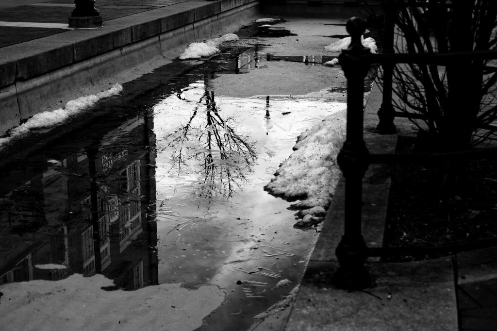
An obligatory puddle reflection photo

Basically, I spent a decade or so just goofing around with cameras. Then, for reasons I can’t recall, I decided to take it all a bit more seriously. I bought my first serious camera (a Canon A1) and I began to teach myself, in a semi-methodical way, the practice of photography.

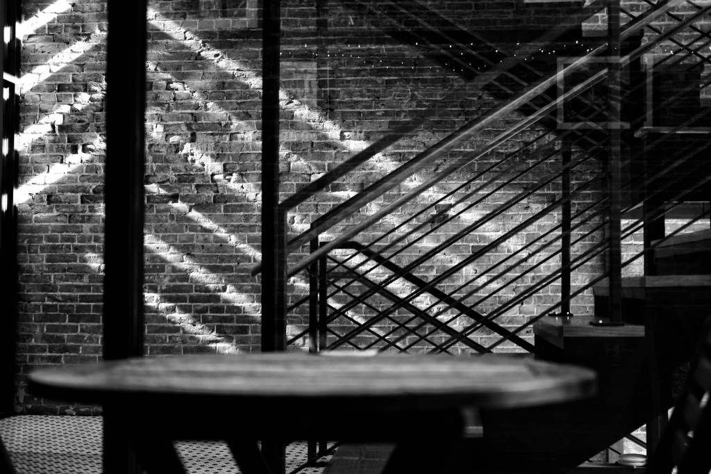
Light getting frisky in an entryway

I say ‘semi-methodical’ because I set a sort of loose curriculum for myself. I’d periodically focus on some specific aspect of photography. Portraiture, for example, or capturing motion. When I decided to become more deliberate in terms of composition, I put a 50mm lens on the camera, put the camera on a tripod, and kept it there for a couple of months.

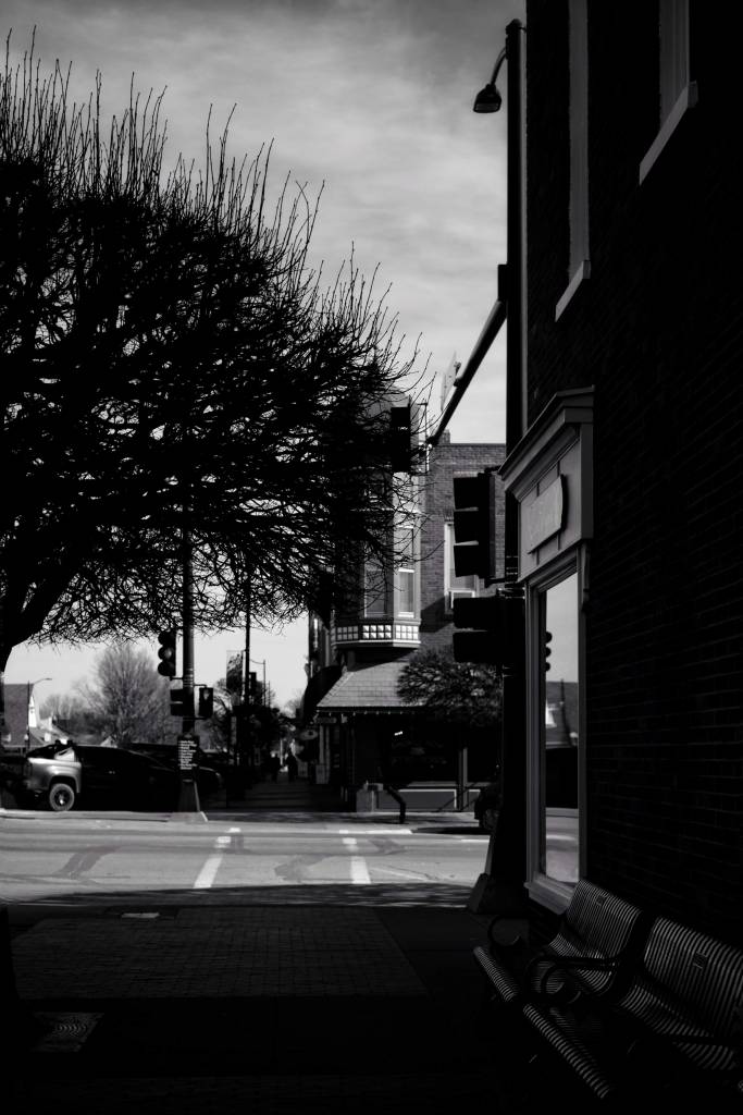
Sometimes you just have to shoot in portrait format.

It was a massive pain in the ass. But it radically changed my approach to shooting. I learned to pay more attention to detail, to be aware of the corners of the compositional frame, to notice distractions within the frame, to be patient, to pre-visualize the composition. Having a prime lens on a tripod slows you down. Instead of simply changing the composition by taking a step forward, or to the left, or squatting down, I’d have to pick up the tripod and move it. Then possibly adjust the height of the camera, or make sure it’s level, or tilting it up or down. It meant thinking about the composition before shooting, and trying to put myself in the right place to avoid any hassle.

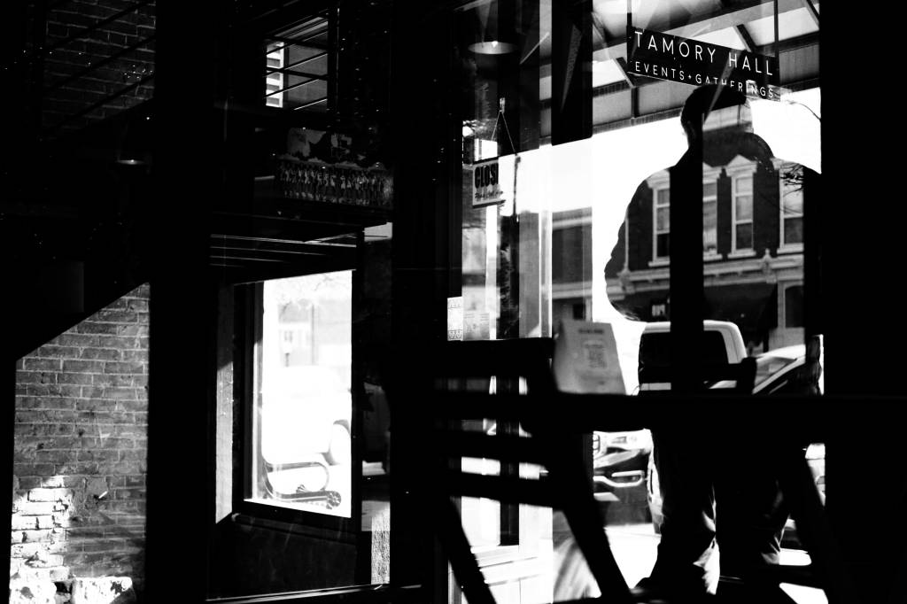
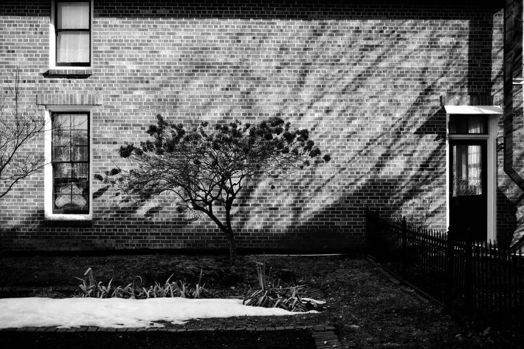
Light, reflections, shadows can get weird

Now I’m thinking about doing something similar. I bought an inexpensive 35mm prime lens with the notion of putting it on another old Fujifilm camera (an X-T10) and leaving it there. Again, the idea is to force me to be more deliberate when it comes to composition. I’m also considering using that camera to shoot exclusively in black-and-white, to force myself to pay more attention to line, form, shape, and shadow.

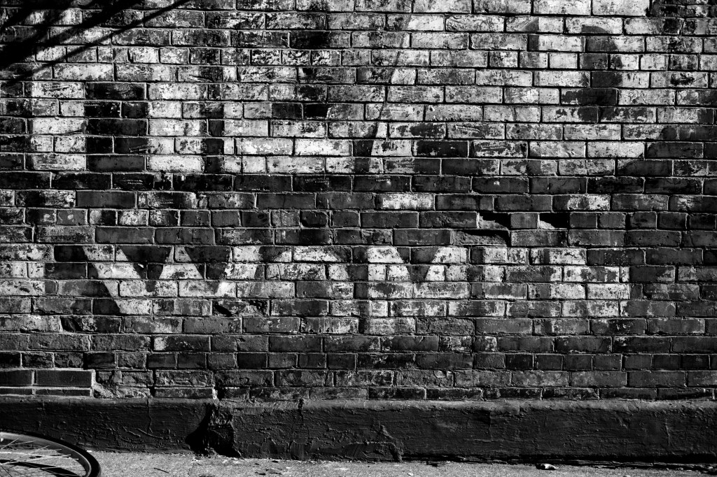
Parked car prevented me from getting the entire ghost sign.

So far, I’ve only taken the X-T10 out once with those restrictions, and I have to say the results were mixed. I’d forgotten some very obvious problems with that approach. For example, physical obstructions can’t be negotiated. If, for example, a parked car makes it impossible to step as far back as you need to get everything you want in the frame, you’re just fucked. And working in monochrome denies you the joy of shooting a photo simply because the colors make something interesting. There was a coffee shop window with yellow, blue, and red vinyl seats, and I was terribly tempted to switch to a color profile. I told myself I can always go back with another camera. Which might be a lie.

Monochrome prevents you from seeing how impossibly green the plants in the snow were.

Shooting with a single prime lens turned out to be annoying as fuck. But it was also weirdly fun. I don’t know how long I’ll continue to abide by my self-imposed ‘prime lens in monochrome’ restrictions (and, of course, I’ll continue to shoot with my older and tinier Fujifilm X10), but my first foray was fun. And fun is what it’s about, right?

At least it is for me.

nobody can understand?

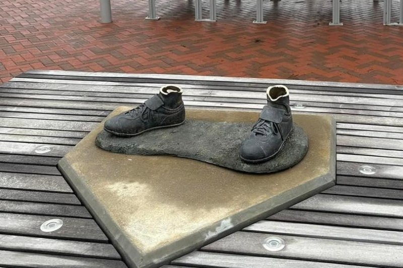
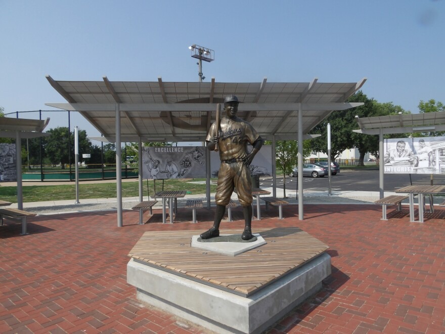
Here are the pertinent facts: 1) In 2021, a youth baseball nonprofit in Wichita, Kansas erected a life-sized bronze statue of Jackie Robinson—the player who broke the color barrier in major league baseball—in McAdam’s Park. 2) This year, on January 25th, after midnight, a couple of assholes cut that statue off at the ankles, loaded it onto a pickup, and drove off. There is surveillance footage of the vandalism and theft. 3) Five days later, the day before Jackie Robinson’s birthday, the Wichita Fire Department responded to a fire in Garvey Park and found the remains of the statue.

I’m appalled by this, but not terribly surprised. Open racism and hatred has become more common in the Trump era. And just to be clear, I’m not saying Trump himself is responsible for the hatred. I’m saying Trump essentially gave permission for existing racists to be more openly racist. Trump’s hate and rage made other racists feel comfortable in expressing their hate and rage.

What DOES surprise me, though, is the reluctance of so many people and so many news outlets to say what’s so plainly fucking obvious. Which is that this was clearly a hate crime. Local law enforcement officials haven’t offered an opinion about the vandals’ motive, but that’s essentially to protect any future prosecution. But how to you explain Bob Lutz, the director of League 42 (the nonprofit that installed the sculpture) saying, “Nobody can understand why this would happen.” Really, Bob? I think everybody can easily understand why it happened. Just ask around, Bob.

And then there’s Mike Freeman in USA Today. He wrote:

What happened? Was it a prank that went too far? Was it an act of racism? We don’t know yet.

We KNOW what happened. And Jesus suffering fuck, it was obviously NOT a goddamn prank. Since the two assholes involved haven’t been identified or arrested yet, we don’t have any direct admission that it was an act of racism. But given the fact that it was a statue of Jackie Robinson and that it was stolen and destroyed around his birthday, I think we’re pretty safe in saying there’s a really really really high probability that racism was the motive.

The statue will be replaced, of course. The money to replace it has already been raised. Although the original sculptor, John Parsons, is dead, the mold still exists and is viable. So the statue of Jackie Robinson will return. He’ll be back in McAdam’s Park, hand on hip, confident, smiling.

But the racism that destroyed the statue in Wichita still exists.

Here’s another ‘but.’ A more important ‘but.’ BUT there are at least seven other statues of Jackie Robinson scattered around the US.

Here’s the thing about statues of real people: they’re not really a celebration of that person. They’re actually an endorsement of the values that person stood for. That’s why we’ve been tearing down statues of Civil War generals. That’s why we’ve put up statues of Jackie Robinson.

six minutes

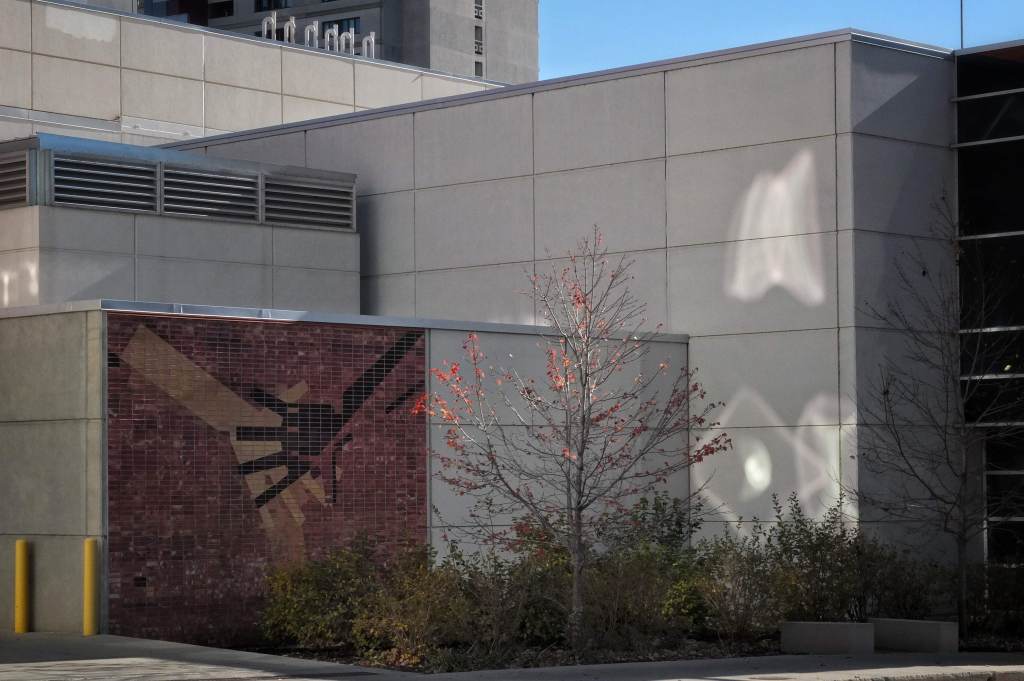
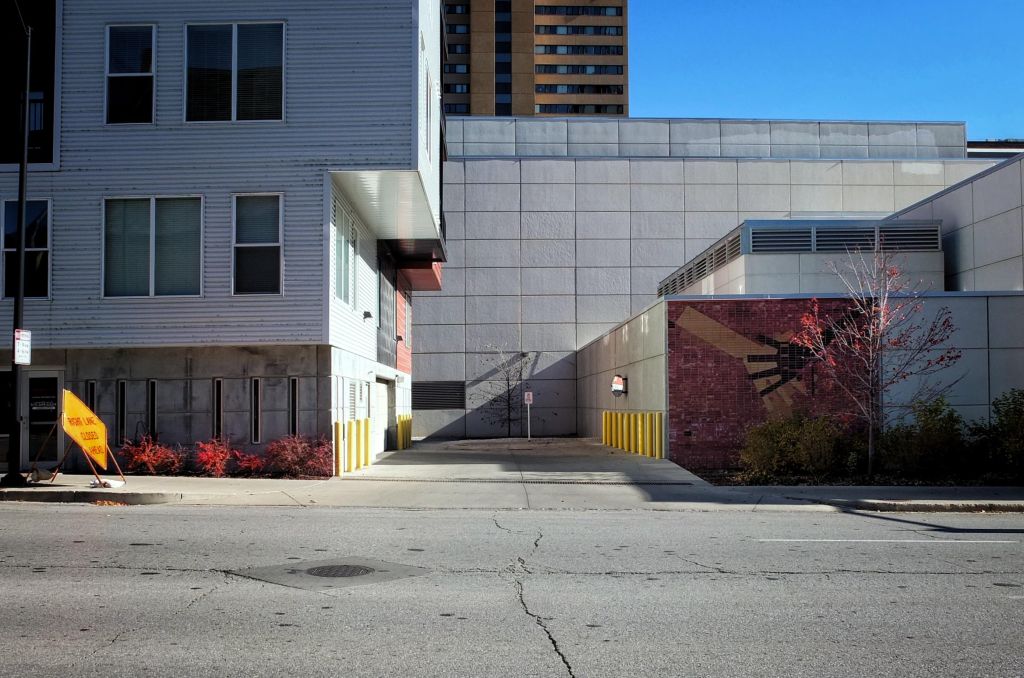
So I’m walking down the street last Saturday, right? And I see these weirdly-shaped areas of light on the side of a building–light reflected off another nearby building. The light is also illuminating just the top of a tree that’s almost completely devoid of its Autumn leaves. The nearly-bare tree is beside a tile mural of two hands–one black, one white–touching each other. The fingers on the hands sort of mirror the limbs of the tree. Everything there is odd and lovely and since I’ve got my little 12-year-old, 12 megapixel Fujifilm X10 in a pocket, I stop and shoot the photo.

And I’m happy with it. So I keep walking and I notice the mural is directly next to a cul-de-sac that’s the entrance to an underground parking garage for an apartment building (the building that’s creating the weird reflections in the first photo). There are a LOT of lovely yellow bollards (I have a thing for bollards) in the cul-de-sac that are sort of balanced by a yellow ‘Lane closed’ sign. Even better, there are some reddish shrubs that sort of balance the red of the illuminated tree. Better still, there’s a delicious acute right angle of shadow right in the middle–and in the middle of the shadow, another tree. And I’m immediately smitten by all the colors and the lines of the various buildings. So I stop and shoot the photo.

I want to get closer to those bollards, so I cross the street, where I discover that there are sections of the apartment complex that couldn’t be seen from a distance. Lovely red and black color blocks, with windows that cast still more reflections on the wall opposite. A circular convex mirror reflects those red and black colors. I notice that the wall at the back of the cul-de-sac, which appeared white from a distance, is actually a very pale shade of blue, that’s enhanced by the slight shift in the angle of the light. The angle of shadow is somewhat less acute. There’s a strange curving line of electrical tubing for a lamp, and some crazy shadows. Those yellow bollards, also catching some reflected light, seem almost decadent. And so many glorious straight lines at interesting angles to each other. Finally, right in the center, a tree which sneers at straight lines. So I took another photo.

Six minutes. According to the EXIF data, that’s how long I spent at that scene. It seemed a lot longer. Six minutes and three shots. Six minutes, drunk on light and shadow and line and shape. Six captivating minutes.

This isn’t unique. Every photographer has had a similar six minutes. They’ve probably had several similar six minute experiences. It’s those six minutes that keep us toting cameras and making a nuisance of ourselves. Six minutes of ineffable delight.

knuckles, back on the map

As some of you may know, Knuckles Dobrovic is the name under which I occasionally create photo projects on Instagram. This began back in 2013. I created the Knuckles alias to explore Instagram, to learn what it was and how it worked, and to do that without having my name associated with it. I thought it made sense to dissociate myself from the account back then; now it just seems silly. In any event, I created the account and began to compile a very simple project. I put a thing on a glass-topped table on my deck and photographed it.

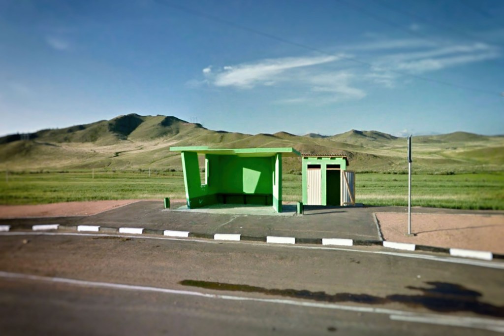
South of Ulan-Ude, Russia

I did that for about a year, during which I realized how ridiculous it was to have an alias account. So I created an IG account in my own name. When Things on a Table was finished, I put the Knuckles account on a shelf and forgot about it. Except–and I realize this is also silly–I’d become attached to the name. So eventually I revived the Knuckles account for another project. And then another. This will be the seventh Knuckles photo project.

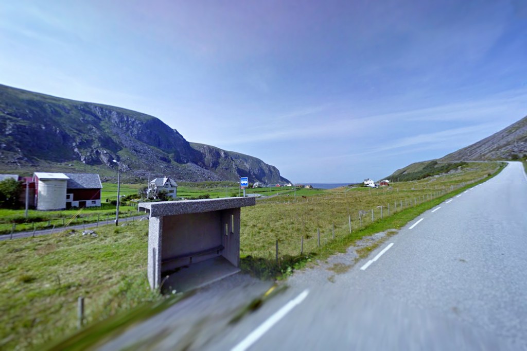
Arvik, Norway

Early on, I cobbled together some simple, flexible parameters for Knuckles projects:

  • It’s got to be simple (which means I won’t have to do a lot of planning or a lot of post-processing).
  • It’s got to be organic to my life (which means it’s something I can photograph during the course of an ordinary day — whatever that is).
  • It’s got to have at least one intellectual component (which is more accurately described as a pretentious bullshit element).
  • It’s got to be able to keep my interest over time.
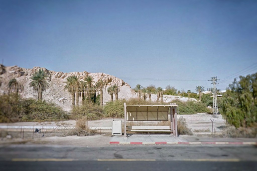
Near Yotvata, Israel

Here’s a quick recap of the various Knuckles projects themselves with a link to a representative image from that project:

  1. Things on a Table — I put a thing on a table and photographed it.
  2. My Feet on the Earth — I took walks, stopping periodically to photograph my feet. I selected two or three of the images during a walk and created multiple exposure images.
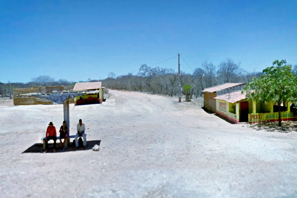
  3. One Hundred Appropriated Google Street Views — This was sort of an homage to Hiroshige’s ‘One Hundred Famous View of Edo’. While playing the online game GeoGuessr (which involves finding a random location based on Google Street View), I made screen captures of interesting vistas. I converted those screen grabs into square black & white images.
  4. Slightly Dislocated — During the enforced isolation of the pandemic, I shot square format photos during my solo walks or masked errands. I diddled with the color a wee bit, digitally sliced the image in thirds, then re-arranged the pieces.
  5. Are Bure Bampot — I’d been playing Geoguessr again, and during a break I read something about Daido Moriyama, the godfather of a photographic style called are bure bokeh, which roughly translates as “rough, coarse/crude, out of focus.” That same afternoon, on Twitter, a Scots acquaintance referred to somebody as ‘a total bampot,’ which I was told means “an idiot, a foolish person, a nutcase”. For reasons I can’t explain, the phrase are bure bampot came to me, and I decided to follow through on it. As before, I made Google Street View screen captures of scenes and locations in Scotland. This time I modified them using the are bure bokeh style.
Unknown location in South Africa

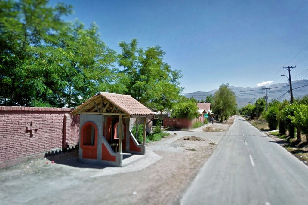
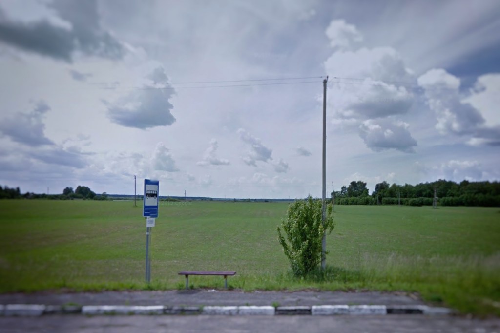
Now I’ve returned yet again to Google Street View with a new project: Bus Stops. I’ve always been intrigued by the bus stops I’ve encountered playing GeoGuessr, and I often pause long enough to get a screen capture of them. I’ve written about my fascination with bus stops before; lots of folks know about my interest. Recently an acquaintance sent me a link to a photo of a primitive bus stop in Turkey. It occurred to me that over the years I’d amassed a small collection of Google Street View screen captures of bus stops.

So I decided to do a quick search my old files and organize them. I found just over a dozen images of bus stops–enough to kickstart a new Knuckles project. It falls well within the Knuckles Criteria: simple, organic to my life, an intellectual component, and since I’ve been doing it haphazardly and thoughtlessly for years I’m not likely to get bored with it.

San Esteban, Chile

The intellectual component? A bus is the most democratic form of public transport. They’re most commonly used by the poor and working classes, but the bus stops for everybody. In cities it’s not uncommon to see people in business attire riding the bus to work. A bus network is fundamentally simple: a series of designated routes with consistent designated arrival/departure times and stable designated boarding locations with predetermined fees. It’s a predictable, reliable, efficient dynamical transportation system in which bus stops act as fixed point attractors. And if that’s not enough, bus stops are ubiquitous. They’re everywhere because a bus network is socially elastic–the design can be stretched to fit almost any community anywhere in the world. But stops are both local and global.

Outside of Petronys, Lithuania

You need more? Bus stops can tell you a lot about a community. Are the bus stops clean? Cared for? Are they in poor repair? Are they stylish or simple? Some bus stops have trash receptacles. Some are trash receptacles themselves. Some are shelters, designed to please the eye as well as keep riders dry and protect them from the wind. Some are purely utilitarian. Some are nothing more than a wide space in the road. You look at a bus stop, you learn something about the people who use them and the communities in which they live.

Bus stops are fascinating. But you have to look at them. So here…take a look.

return of the sunday salon

I’ve been shooting photographs for most of my life. I’m a competent photographer. But for most of my life, I was also pretty ignorant about the history and culture of photography. Oh, I knew the names of some of the Big Hats in photography and could probably recognize some of their photos. But I had no real understanding at all of what had been done in photography, or who had done it, how they’d done it, or what they were thinking when they did it. I was the Jon Snow of photographic culture. I knew nothing.

So I set out to correct that. I decided to educate myself. I did it in a fairly haphazard and casual way– picking a photographer who’d caught my attention for some reason and doing some research on them. I also decided to share what I’d learned. At the time, I was the managing editor for Utata, an online collective of smart, creative, funny, curious people who enjoyed photography and discussion in equal measure. So I wrote a short essay on the photographers I studied and used those as a foundation for discussion in the group’s online forum on Flickr.

It was fun at first. I did an essay every week. Then after a while, it was every other week. It was still basically fun, and I learned a lot. But after a few years, it became a chore. A pleasant chore, for the most part, but still a chore. And like one does with a chore, I began to find reasons to avoid doing it.

And then I stopped.

I just didn’t want to do it anymore. I continued to read about photographers and think about their work, but the idea of writing an essay about them…well, it was simply too much unpaid labor. The last Sunday Salon was published in July of 2017.

A year or so later I learned a change in Flickr’s API (I have no idea what an API is, but it changed) had essentially gutted the Sunday Salons; they were no longer available online. Nobody could see them. I was okay with that. I didn’t really care. The salons had been a personal project, after all, and I’d accomplished what I wanted to accomplish. If they were gone, they were gone.

A few years went by. A few folks would occasionally mention something they’d learned from the salons, but I gave them little or no thought. Until about a year ago, when I got the urge to write another one. But I didn’t do it. I mean, why write an essay for a site that couldn’t display them? But I got in touch with Utata’s tech ninja, David Winkinson, who is one of the most thoughtful, generous, and considerate tech ninja’s ever. Would it be possible to resurrect the old site? The answer was ‘Not entirely; not the photos.’ But he said he could restore the text and establish it on his personal server. And before I could say, ‘Don’t bother’ he went right ahead and bothered.

And there it was. 170 or so essays. Somewhat buggered up, to be sure, but all the bones were there. They just needed to be collected, put in order, and fleshed out with photo examples from each photographer.

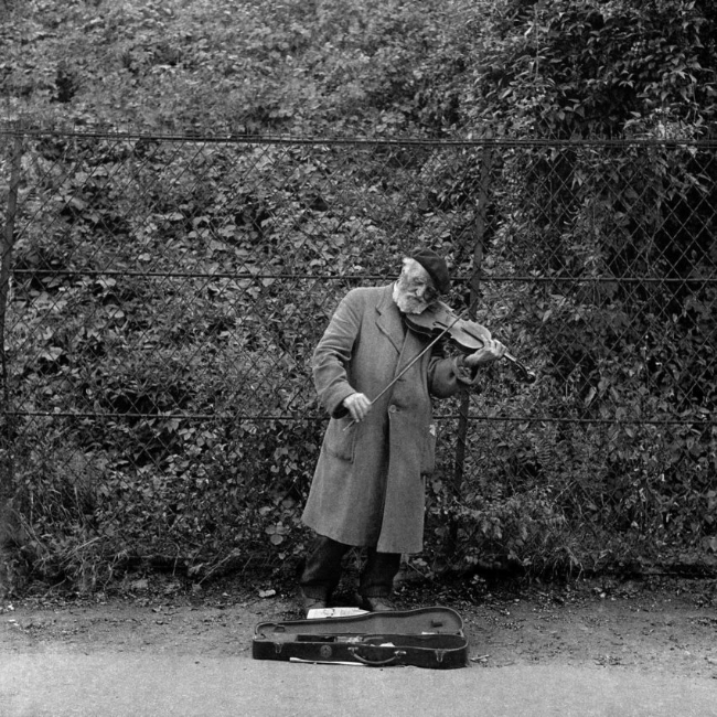
So I’ve spent the last few months sporadically noodling around, rebuilding the damned thing. I have absolutely NO skill at graphic design. I’m not even sure ‘graphic design’ is the appropriate term for what I’m talking about. But I cobbled the Sunday Salon together after a fashion. I’d have spent more time trying to figure out how to make it more presentable and more useful, but last week Adolfo Kaminsky died.

Violinist, 1945, by Adolfo Kaminsky

Odds are, you’ve no idea who Adolfo Kaminsky was. But you should. So I wrote a Sunday Salon about him (yes, I know today isn’t Sunday, but c’mon, let’s not get fussy at this point). Click on the link if you’re interested.

So here you go. The return of the Sunday Salon. You can find them all right here. Or just click on the Sunday Salon link at the top of the page.

c’mon, we’re talking about elves here

In yet another episode in the continuing saga of Whiny-ass Complaints of Butt-hurt MAGA Fuckwits we learn there are people who are offended by the notion that elves aren’t necessarily White People. Seriously. This idiotic fuss is about the new Lord of the Rings prequel that has apparently just been released (see Editorial Note at the end).

“Casting a non-White actor to play an elf makes it more difficult for audiences to maintain their willing suspension of belief.”

No, it doesn’t. Casting a non-white actor to play an elf makes it more difficult for racist assholes to maintain their willing suspension of disbelief. The quote above was, according to CNN, from Louis Markos, who is apparently the author of From A to Z to Middle Earth with J.R.R. Tolkien.

This Markos guy gets at least three things wrong. First, of course, is he misquotes Samuel Taylor Coleridge’s phrase– the willing suspension of disbelief. Back in 1817, Coleridge suggested that if a writer introduced “‘human interest and a semblance of truth’ into a fantastic tale, the reader would suspend judgement concerning the implausibility of the narrative.” This is why television viewers were willing to watch 12 seasons of Murder, She Wrote–they were willing to suspend their disbelief that Jessica Fletcher encountered more than 250 murders in the small Maine village of Cabot Cove. All fiction depends to some degree on the reader/viewer’s willing suspension of disbelief.

Second, Markos says casting actors of color as elves threatens the story’s ‘believability’ because Tolkien described elves as “fair-faced.” The term fair comes from the Old English term fæger, which when applied to living things meant “pleasing to the eye, attractive” and when applied to weather meant “clear, bright, pleasant”. Tolkien, remember, was an academic who studied Old English and Anglo-Saxon literature, and had at one time worked for the Old English Dictionary as an expert in etymology. He knew what ‘fair’ meant and how it applied to faces. Markos clearly doesn’t. Or–and I suppose this is a real possibility–he simply doesn’t believe non-White folks can be pleasing to the eye. It’s fucked up either way.

Wait…what’s this? Could it be? Elves of color? What?

Third, Markos claims casting actors of color “…is not something organic that’s coming out of Middle-earth. This is really an agenda that is being imposed upon it.” He’s almost got a point here. Almost. Tolkien’s Middle-earth is based on the Norse Miðgarðr, which they broadly described as the world “inhabited by and known to humans.” In the literature, Miðgarðr actually referred to the defensive wall around the world constructed by the gods from the eyebrows of the giant Ymir (which, by the way, requires some serious fucking suspension of disbelief). But Tolkien used Middle-earth to describe an imaginary period of the Earth’s past when peoples other than Men (elves, dwarves, trolls, hobbits, orcs, ents, etc.) still inhabited the planet, although in dwindling numbers. His Middle-earth did sort of correspond to western Europe in terms of geography.

But to my knowledge, there’s nothing Tolkien wrote to suggest peoples other than Men (and Tolkien used ‘Men’ to refer to all humankind) were necessarily White. I mean, we’re talking about elves here. If you can’t deal with Black or Asian or Indonesian or pick-a-race elves, then the problem isn’t your capacity to suspend disbelief. The problem is you’re a racist asshole.

EDITORIAL NOTE: I haven’t seen the show I’m talking about, which ordinarily would be a problem. But in this instance, the show itself is less important than the books on which the story is based and the credentials of the person who wrote them. I haven’t been inclined to watch the show, mainly because I had the misfortune of watching the first of Peter Jackson’s wretched interpretation of The Hobbit. That was enough to eradicate any desire to see any new visualization of Tolkien’s work.

But I’m actually hearing good things about this show from people who were as skeptical about it as I was. So at some point I’ll probably watch it.

Also? I usually like to include an image in these blog posts, and I did a quick image search for Rings of Power and saw some images of POC in costume, but since I couldn’t see their ears I’ve no idea if they were meant to be elves or something else. I didn’t want to just drop in some random image of a Black actor who may or may not be an elf, so…no image.

EDITORIAL NOTE 2: Thanks to Mark Alexander, we now have an imbedded image to demonstrate…well, I’m not exactly sure what it demonstrates. That actors of color can play non-human roles in fantasy stories? We already knew that. I guess it demonstrates just how fucking idiotic it is for racists to get frantic about Black actors getting gigs as elves.

just to explain why i took a photo

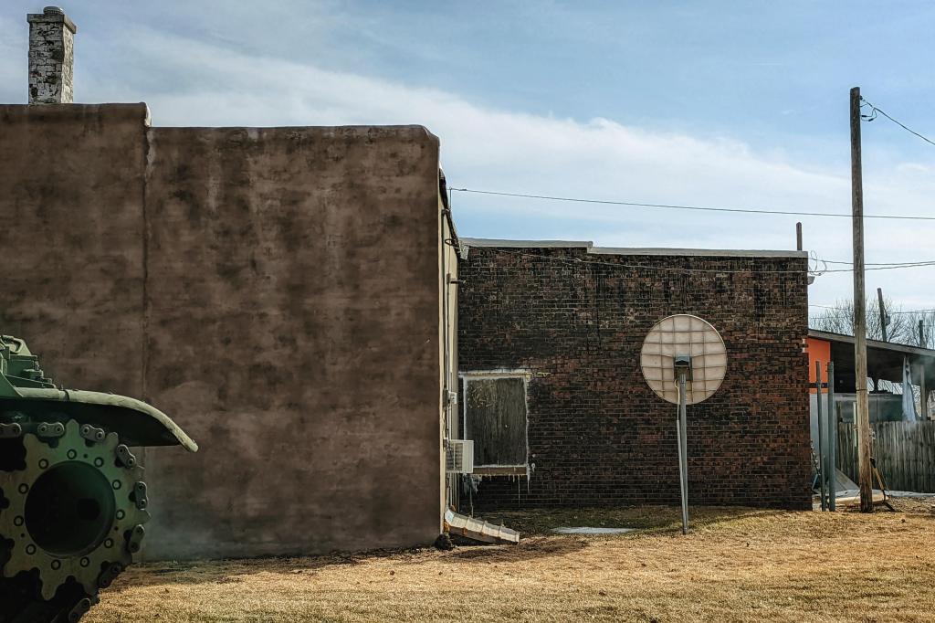
Last week while out noodling around I came across a tank. When I say ‘tank’ I mean a decommissioned military tank. An M60 battle tank, to be exact. It’s fairly common when the military starts scrapping old tanks, they offer them to small towns to use as memorials, or to ‘decorate’ public parks or town squares or wherever the hell a small town would like to park one. The US military stopped deploying M60s in 1997.

But this isn’t about the tank, really. It’s about how I photographed it. Which was like this:

A friend asked me a couple of questions about the photo. First, what the hell is this a photograph of? Second, if it’s a photograph of a tank, why didn’t I include the whole tank? Those are valid questions. But they’re difficult to answer.

They’re difficult to answer for several reasons. The primary reason is that I’ve been shooting photos for so long that I rarely actually think about composition. I just kind of know what I want in the frame. Another reason it’s difficult to explain is because shooting a photo seems like it’s just a matter of releasing the shutter (or, with a cell phone, poking the whatsit that initiates the photo). But that moment is the result of a fairly complex process.

I wasn’t paying much attention to the process when I shot this, but I’ll try to recreate my thinking. Obviously, it began by getting out of the car to look at the tank because…well, there was a tank and I wanted to look at it. As I walked around it, I was attracted to that cascade of squarish shapes made by the building–so many different-sized squares of different textures. Then there was that white circle that sort of balanced the round rear tread wheel of the tank. And then there were those sweet vertical lines of the chimney and the light pole. And then I was drawn to that tiny splash of red, and that diagonal slant of the roof of the shed, and even the spade leaning against the light pole. All of those things appealed to me, both individually and as a collective.

I’d be lying if I said I noted all that stuff in that order, but when you’re lining up a shot it’s like your brain is ticking off boxes in a list. That works, that works, that doesn’t–so move a bit, that works. And then there’s some point when your synapses seem to agree that you’ve got all–or most–of the stuff you want in the frame, and you take the photo.

I’d probably have taken that photo even if the tank wasn’t there, because the light and the geometry appealed to me. But it was the tank that drew me to that spot and to me, that wee bit of tank is important to the composition. So, to me, it’s still a photo of the tank. The rest of the tank is implied.

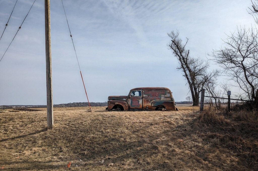
Wait…I think I can explain this better. That same day, I took a photo of an old, rusted out Ford panel truck. Three photos, in fact, but only one photo mattered. Here’s the first photo.

There’s nothing wrong with this as a photo. Again, I composed it intuitively, without a lot of thought. It’s got good lines. The curve of that tree is nice; it sorta kinda follows the shape of the truck. There’s a decent balance to the composition. It’s a perfectly adequate photo, a decent documentation of an old, rusted out Ford panel truck. Nothing wrong with it, but not terribly interesting.

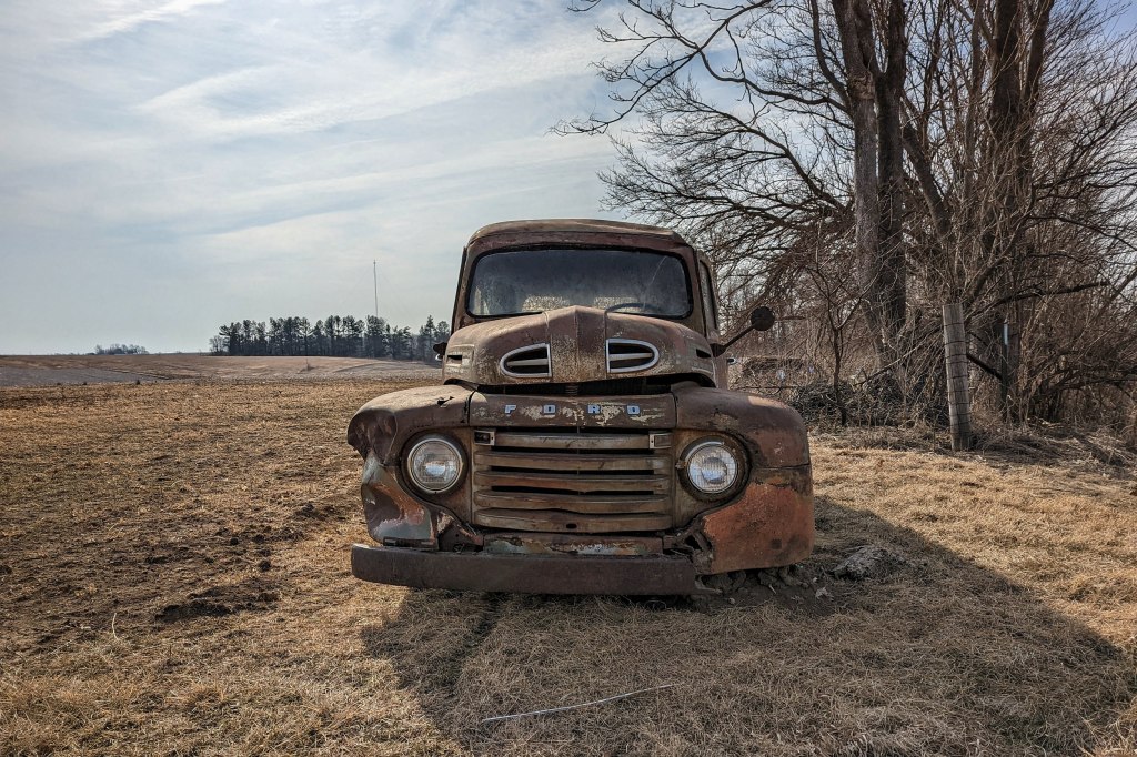
So I got closer. Changed the perspective.

Again, there’s nothing wrong with this photo. Again, the composition was casual but deliberate. However, you’ve probably seen ten thousand photos almost exactly like this. A rusty wreck of a vehicle–an artifact of an outdated civilization cast aside in a living environment that will continue to grow while the artifact slowly degrades into nothingness. The best thing about this photo is that it places the panel truck in a larger landscape, which emphasizes how out of place it is. But basically, there’s nothing new to see in this photo.

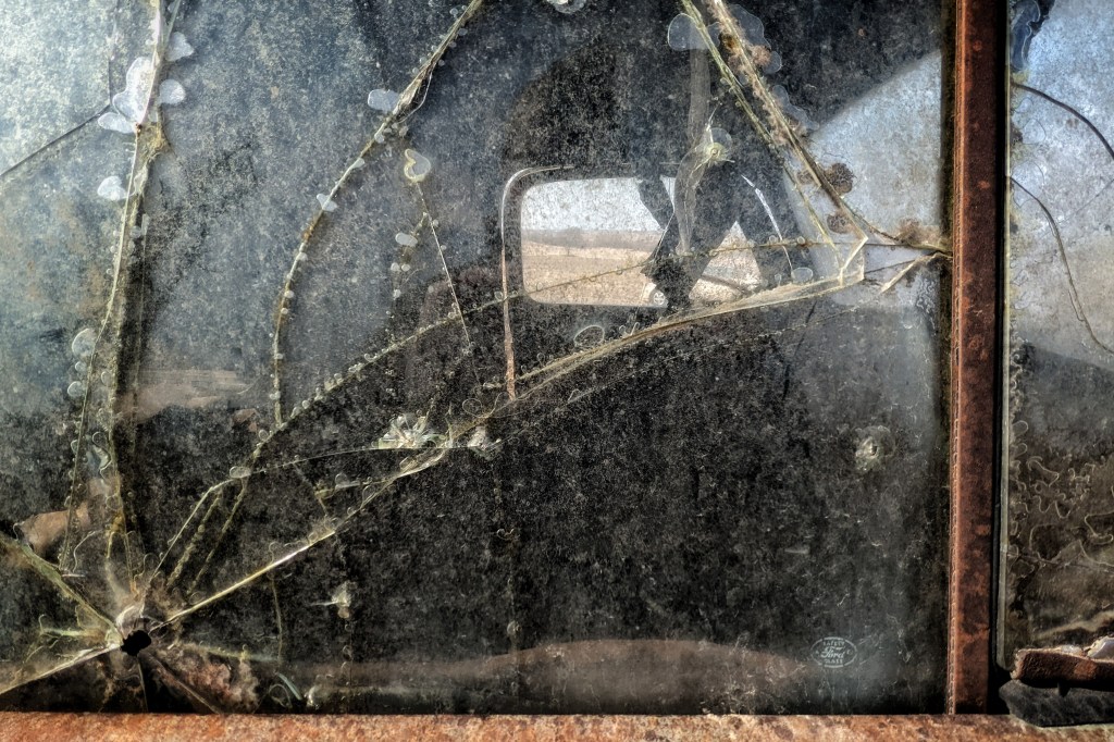
So I got closer and changed the perspective again.

This is the photo that mattered. I took a bit more care with the composition. I knew I wanted the rust, I knew I wanted the suggestion of a large landscape through the windows, and I knew I wanted the lines of the shattered window and those bubbles formed by the thin layer of ice.

The actual old, rusted out Ford panel truck wasn’t really important; it’s the idea of the old, rusted out Ford panel truck that mattered. It’s a photo of an abandoned vehicle in the same way the first photo is a photo of a tank. The old, rusted out Ford panel truck is implied; you only need to see enough of it to hint at its existence.

The photo of the tank and the final photo of the panel truck are both photos of things that don’t belong there. Was I actually thinking of that when I took those photos? Nope. But after you’ve shot enough photos, a sort of algorithm develops in your brain. It’s like you know at the cellular level that everything in the frame matters, so you become very deliberate about what you keep in and what you keep out.

What you choose to include and exclude is grounded on why you’re shooting the photo. And that’s the thing. You may not be consciously aware that you’re shooting a photo of things that don’t belong where they are, but there’s some chunk of your brain that’s is actively registering that fact. If the tank or the panel truck were what mattered, you’d just photograph the tank and the panel truck. But you keep looking and moving and shifting around until your brain is at least semi-satisfied. Then you take the photo.

Okay, I’ve made the mistake of re-reading this (which I generally try to avoid in these blog posts). It sounds to me like I’m talking bullshit here (which is why I generally avoid re-reading these blog posts). But I’m still convinced that this is how I shoot photos. I can’t tell you how many times I’ve approached something that I wanted to photograph–that I felt was very photographable–and then walked away without taking a single shot because I couldn’t get what I wanted in the frame. There was something in the frame I didn’t want, or something I wanted but couldn’t include. My mind knew it, even if I wasn’t immediately aware of it.

The photographer Marc Riboud once said, “I photograph the way a musician hums.” That makes sense to me. Musicians, even when they’re just idly humming, know without thinking which notes work and which notes don’t. The wrong note ruins the composition.

And there it is.