from the world of the batshit crazy

A couple times a week I visit a few extreme right wing conservative websites. I tell myself it’s because it’s important to try to understand people with whom you disagree–even if you disagree strongly. And I believe that’s true. But it’s also true that I visit those sites because they make me laugh. Sometimes they’re so wildly illogical that you have to wonder if they’re actually parody. Maybe some sort of performance art.

Sometimes, of course, those sites are just sad and pathetic. And sometimes there is so much hate and rage behind the posts that it’s a tad frightening. And then there are the times when they become so batshit crazy–so divorced from anything remotely resembling reality–that they generate a sort of out-of-body, hallucinatory experience.

Today was one of those days. It all begins with a White House photograph showing President Barack Obama wearing a pair of glasses while napping on a sofa. But wait, you say, the president doesn’t wear glasses. So why is he wearing them? And why would he wear them when napping?

Because those aren’t just any old pair of glasses. No sir, no ma’am–according to a few right wing bloggers, those are the very glasses worn by Malcolm X on the day he was assassinated!

How did the president obtain those glasses?

From his mother, obviously. There is speculation (and seriously, I’m really not making any of this up) among some of the more lunatic right wing Obama-watchers that Malcolm X was actually the president’s biological father. If a person is capable of believing that, then it’s only a short walk down Loopy Street to believing Obama’s mother was present in the audience on the day Malcolm X was murdered. And if she was there, then…

…the pandemonium that ensued when Malcolm was shot dead on that stage could have left Stanley Ann Dunham ignored while the slain leader’s distraught wife and family members hurried to the hospital…. Did the President’s mother grab these glasses for safe keeping to give them to her son? Was she ignored, forgotten? Were these glasses all she could take away from that horrible scene?

If it’s possible, then it must be true! There’s no other logical explanation for the president to be wearing a pair of glasses while taking a nap! His mother, teenage lover Stanley Ann…unable to follow Malcolm to the hospital because of Malcolm’s wife and child, is left behind, grief-stricken and horrified. And then, almost as if by magic, there, amidst the hideous chaos, are his eyeglasses. His precious, signature, tragically broken eyeglasses. So of course she took them to give to her three year old son, because he’d need them in the future when he’d be napping as president. Any mother would do the same.

What…you want even MORE proof? Here it is:

When Malcolm was shot at the Audubon Ballroom, 21 February 1965, as usual, he was wearing his eyeglasses.

Yet when he was wheeled out, his eyeglasses were off.

Then –

No eyeglasses on Malcolm’s body at the wake.

No eyeglasses at the funeral.

Whatever happened to Malcolm X’s eyeglasses?

Now that we have the White House photo, above, it may not be a mystery after all.

Satisfied now? Malcolm X was Barack Obama’s biological father. How do we know that? Because despite the fact that there’s an unfortunate lack of evidence that Ann Dunham and Malcolm X were ever in the same town at the same time, he and President Obama sorta kinda look alike (I swear, I am NOT making this up). Malcolm X was assassinated and his glasses mysteriously disappeared. How do we know that? Because they’re not in a photograph of the crime scene, and any disappearance is mysterious by definition.

But since there’s now indisputable photographic evidence that non-eyeglass-wearing Obama is clearly wearing glasses while napping, and since he’s indisputably the love child of Malcolm X and since Malcolm X’s indisputable glasses are indisputably nowhere to be found, surely there can’t be any dispute. Those MUST be the glasses of Malcolm X.

Welcome to the world of the batshit crazy.

not quite yet

In the 1930s the Banner Coal Company explored “an unusually good grade” of coal in central Iowa, just a few miles south of Des Moines. The vein was rather shallow, buried beneath only forty feet of soil and shale. The shallow depth and the fragile ‘roof’ made mining the coal problematic. Traditional mining techniques wouldn’t work. So the company resorted to the open pit process.

Open pit mining wasn’t new. The practice had been used in the U.S. for a century–since the 1830s. The Banner Coal Company knew how to wrench the most product from the earth with the least fuss (and the most profit). They brought in the largest electric dragline excavator in the country (spectators traveled for miles to watch the massive machine at work) and for the next two decades they hauled coal out of the pits. It was the largest strip mining project in Iowa history.

By the mid-1950s, the coal was gone–and when the coal was gone, the coal company went with it. They sold the land–some 220 acres–to the Iowa Department of Natural Resources, which intended to turn the area into a wildlife management area. The operative term there is intended.

Half a century passed without much being done. The pits slowly filled with groundwater. Natural flora grew wherever there was enough soil to support it. Growth on the waste-rock and tailings was spotty to say the least, and the only plants that grew were brought there by wind and wildlife. But the wildlife came, drawn by the water. It came, settled, made nests, created dens. It wasn’t just animals–kids were also drawn in by the deep pools of dark water (that attraction almost certainly heightened by parental warnings against the place).

In addition to the 80 acres of former-pit-turned-lake, the landscape is dotted with strange little pocket marshes and hidden sloughs where turtles and frogs squat with cranky blackbirds and condescending herons. In 2002 the Department of Natural Resources finally decided to turn the site into a state park. They built bicycle trails (for both casual cyclists and adrenalin-crazed mountain bikers), they set up picnic tables, added a boat ramp, and brought in other amenities.

Despite the work that’s been done, the area still has an odd, semi-feral, almost post-apocalyptic feel. There’s a sense that Nature is patiently and unceasingly trying to overcome the damage done by thoughtless humans. Trying, but it’s been a struggle.

I feel strangely at ease here. As much as I despise the damage done by the Banner Coal Company, I can’t get too pissed off at them. In the 1930s they had little knowledge about the long term effects of this type of mining operation. In their ignorance, they created a landscape that feels wounded–even mutilated. And yet it’s a very compelling landscape, partly because of the harm that was done and partly because of the organic regrowth that hasn’t quite been able to repair the damage. Yet.

I like that yet. It’s a good yet. A comforting yet. Some day this area will lose its post-apo air. It’ll just be an unusual lake. Some day. But not quite yet.

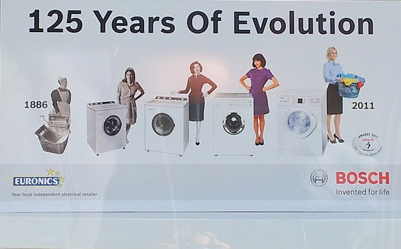
the evolutionary process

Well. I suppose it’s a good thing that Bosch believes in evolution. That certainly puts the company ahead of the entire field of Republican presidential candidates.

But perhaps this is a way to make evolution palatable to those Republicans? Maybe they’ll accept the science if it suggests women were created by god to do laundry—and evolution has made them fit to do it in heels.

loss of control

Nobody warned me.

I can’t believe it…but nobody said a damned thing to me about the danger of typography addiction. There I was, innocently trying to create a cover design for an e-book. A babe in the woods, that’s what I was. A babe in the fucking woods. “Go download some fonts,” they said. “Try a little League Gothic. Have a taste of some Trajan. Go ahead, it’ll be okay.”

Do you know how many typefaces are out there? More than Carl Sagan could count. Do you know how many of them I downloaded? ALL OF THEM. I don’t know serif from Shinola, but I’ve probably got a typeface by that name. Right now I seem to be drawn to something called Astonished. Why? I have no fucking clue. I think because it looks like it was designed by somebody trying to scratch his way out of an abandoned refrigerator.

I’m exaggerating slightly. In truth, I’ve always been attracted by the idea of typography. I like the theory behind it. I’ve just never had to deal with the reality of it  I suspect that after a few days I’ll develop some sense of discretion, of aesthetic discernment, some sideways control over my indiscriminate font-bingeing.

But right now, I’m just another sailor on shore leave, looking for a gypsy good time.

poor bastard

The beauty of traditional publishing is that all the writer has to do is write. That’s it. You make shit up and write it down. You finish the manuscript, you take it to the Post Office or Federal Express, you drop it in an envelope, send the damned thing off and that’s it. You can forget about it and move on to the next project. Easy peasy, as they say.

Some other poor bastard (or several poor bastards) will have to do the grunt work of copy editing, and considering issues of typeface, and dealing with formatting, and coming up with cover art.

But e-publishing makes every writer a poor bastard—at least in the sense of all the grunt work that’s necessary to prepare the manuscript for publication. Copy editing? You have to do it. Typeface and formatting? Figure it out. Cover art? Dude, it’s all up to you. You can stare at your computer and say “Dammit, Jim—I’m a doctor, not an engineer.” But you still have to get the warp engines back on line.

I’m okay with the copy editing. I hate it, but I can do it. I don’t know dick about typeface, but I can see that there are certain industry standards and follow those. I can cope with the formatting because the e-publishing software makes it a bit easier. But cover art? Dammit, Jim—I’m a writer, not a graphic designer.

Graphic designers never get the credit they deserve. I’ve known this for a long time—partly because graphic designers keep telling me it’s so, and partly because I’ve seen graphic designers make almost unnoticeable changes that somehow magically turns a dull design into one that seizes and holds the eye and the imagination. So I’ve known graphic designers have their own peculiar genius, but now that I’ve tried to build a book cover, I appreciate it all the more.

I tried to take a lot of things into account. The cover is for a book of non-traditional detective stories, so I wanted the cover to have a light noir-ish vibe—somewhat urban, but not quite hard-boiled. I wanted it to relate to something that appears in the stories—a setting, an object, an atmosphere. I wanted the cover to be clean and simple and somewhat austere.

I guess I’ve made maybe a couple dozen different covers now. They all look too simplistic to me. They look like—well, they look like I made them. They don’t look to me like real book covers. I spent an inordinate amount of time looking at e-book covers on Amazon.com and B&N.com, and I’ve got myself so turned around at this point that they don’t look like real book covers either.

I suspect I’ll settle for one of these four covers. Years ago I learned to be able to let go of a manuscript; now I have to learn to do the same with a book cover.

But this shit ain’t easy.

trees

Maybe it’s silly, but I develop a sort of relationship with certain trees. I grow fond of them; it pleases me to see them when I’m in the vicinity. It’s something about the shape of the tree, or maybe where the tree is located—who knows how these things begin? What matters is there are specific trees that make me happy.

This is one of them:

That one off to the left—the one that looks sort of like a mitten from this angle—that’s the tree. I actually shot this photo of the feral cat that followed me around one foggy day. See that little white speck? That’s the cat; the little bugger paced me for half an hour or so, never getting any closer than this. But even though I shot the photo of the cat, I made sure the tree was in the frame.

I like that tree for several reasons. I like the way the bike path curves gently around it. I like that crows and hawks hang out there (though not at the same time). I like the fact that unlike some of the other trees along this stretch of the bike path, it was never trimmed back to make it ‘pretty’. It’s just a friendly, accessible, pleasant, unpretentious, somewhat disorderly tree.

It’s a nice tree, isn’t it.

They tore it down.

By ‘they’ I mean city workers. They’re refurbishing the bike path, partly because it’s in a flood plain. Two or three times a year the nearby creek (it’s just on the other side of the tree line) floods. It’s always done that. In fact, the worst train wreck in Iowa history took place just up the road, a result of flooding. Last summer, nearly 300 people had to be evacuated from their homes along the flood plain. So the city bought the property, moved the people, and set about ‘correcting’ the problem. Which required tearing down that tree.

I quizzed the workers about it. As much as I hate to admit it, they seem to have had a legitimate reason for removing the tree, though the reason was incomprehensibly technical. But the men I spoke to assured me no other trees would be removed. And, in fact, they’ve encircled the more tame and orderly trees with plastic snow fencing and yellow caution tape. I guess it makes me feel a tad better.But only a tad.

I miss that tree every time I ride or walk that stretch of the path. Eventually I suppose I’ll get used to not seeing the tree. And that will be a little sad too.

last breath

Somewhere in a filing cabinet stashed (at great inconvenience to everybody involved) in Ohio or Virginia or possibly New York are a few three-ring binders containing Kodachrome transparencies of various old crime scenes. They’re images I shot as a criminal defense investigator–all from cases that never went to trial. Had the cases gone to trial, the images would be filed away somewhere else as evidence. Since the cases were either dismissed or resolved by a plea agreement, the transparencies remained in my possession.

They are, for the most part, the most dull images imaginable. A lot of them are nothing more than establishing shots–photographs taken to establish the features of a location. If, say, a murder took place in a house, you’d begin (or end) your crime scene photography by shooting pictures of the exterior, taking care to include things like street signs and traffic signals and light poles. Evidentiary photographs are about registering clear information that might be helpful to an attorney or to a jury. A conviction or an acquittal might depend on something as mundane as the distance between a front stoop and the nearest light pole.

But also tucked away inside those three-ring binders are images that have no evidentiary value at all. These are photographs I shot simply because they appealed to the eye. There is, for example, a photograph of a blood spatter pattern that splashed across a church calendar hung on a kitchen wall. The calendar has a painting depicting the face of Jesus on the cross. It’s pretty horrible (both the painting itself and the photo showing the blood on the painting), but it’s also visually arresting.

There’s also an abstract image that shows a glass sample container from an old Breathalyzer test. Years ago when suspects were administered a Breathalyzer test to determine their blood alcohol, the samples were kept in glass vials that looked rather like test tubes. Two samples were taken–one of which was sent to the crime lab, the other was set aside for independent testing by the defense. In this case, the accused was charged with vehicular homicide. While awaiting trial, he hung himself in his jail cell. Several months later I discovered the tube while I was cleaning out my evidence locker. It occurred to me that it contained the breath of a dead man. So I photographed it.

There are probably no more than fifteen or twenty such Kodachromes. Except for a few defense lawyers, nobody has ever seen them. I’m not entirely comfortable with them. I’m rather glad they’re unavailable to me now. If I had them, I’m not sure if I’d scan them and make them available for people to see.

I rather think I might, though I’d feel bad about it. I hope I’d feel bad about it.