The beauty of traditional publishing is that all the writer has to do is write. That’s it. You make shit up and write it down. You finish the manuscript, you take it to the Post Office or Federal Express, you drop it in an envelope, send the damned thing off and that’s it. You can forget about it and move on to the next project. Easy peasy, as they say.
Some other poor bastard (or several poor bastards) will have to do the grunt work of copy editing, and considering issues of typeface, and dealing with formatting, and coming up with cover art.
But e-publishing makes every writer a poor bastard—at least in the sense of all the grunt work that’s necessary to prepare the manuscript for publication. Copy editing? You have to do it. Typeface and formatting? Figure it out. Cover art? Dude, it’s all up to you. You can stare at your computer and say “Dammit, Jim—I’m a doctor, not an engineer.” But you still have to get the warp engines back on line.
I’m okay with the copy editing. I hate it, but I can do it. I don’t know dick about typeface, but I can see that there are certain industry standards and follow those. I can cope with the formatting because the e-publishing software makes it a bit easier. But cover art? Dammit, Jim—I’m a writer, not a graphic designer.
Graphic designers never get the credit they deserve. I’ve known this for a long time—partly because graphic designers keep telling me it’s so, and partly because I’ve seen graphic designers make almost unnoticeable changes that somehow magically turns a dull design into one that seizes and holds the eye and the imagination. So I’ve known graphic designers have their own peculiar genius, but now that I’ve tried to build a book cover, I appreciate it all the more.
 I tried to take a lot of things into account. The cover is for a book of non-traditional detective stories, so I wanted the cover to have a light noir-ish vibe—somewhat urban, but not quite hard-boiled. I wanted it to relate to something that appears in the stories—a setting, an object, an atmosphere. I wanted the cover to be clean and simple and somewhat austere.
 I guess I’ve made maybe a couple dozen different covers now. They all look too simplistic to me. They look like—well, they look like I made them. They don’t look to me like real book covers. I spent an inordinate amount of time looking at e-book covers on Amazon.com and B&N.com, and I’ve got myself so turned around at this point that they don’t look like real book covers either.
I suspect I’ll settle for one of these four covers. Years ago I learned to be able to let go of a manuscript; now I have to learn to do the same with a book cover.
But this shit ain’t easy.

I like the one with the brick building. Maybe you should have two different fonts? The third one has an older feel to it. Like something from the 1950s.When will we be able to read it?
LikeLike
I like number three (far left second row). And I agree with Steffe – maybe a different font for one of the elements (either title or author). OR put the author’s name (and who is that author? he sounds intriguing and mysterious) in a different color. You could sample the color of the red building barely peaking out on the left and use that color for the author’s name.
LikeLike
I am an amateur student of book covers because we use books as art in our home. These are really compelling, Greg, and look very professional. They all make me want to pick up the book; your photographs are wonderful. My eye is drawn most to the top 2, though I do love the bridge photograph in the right bottom corner. If you use that one, you might try making your name just a tad smaller. If the book were mine, I’d be tempted to use the top 2, with one on the front, and the other on the back. They just look very cool together. Given your description of the stories, I like the font and simple lay-out you’ve chosen. Love the title, even if I am a bit afraid to read that particular story. Do let us know when the book is available! (and email me if you need a copy editor)
LikeLike
I like the third one too.
Something about that alley is so inviting.
Much like opening the pages of your new book.
LikeLike
I’ve been struggling with book covers too, and you’re right, it’s skilled work. I like the 2nd and 3rd ones.
As authors are being expected to take on more and more of the process (I’m thinking of marketing in particular but I’ve heard the copy editing is pretty much non-existent in UK publishing houses), I’m coming to the conclusion that you may as well take on the whole process or subcontract cover design/formatting.
LikeLike
Glad I found this post since I’ll be tackling the cover design issue myself for the first time next month.
As for your covers, I like the 3rd one as well, the alley view. However, I suggest not stacking the title, but rather have it horizontal like in cover 2 & 4.
Another thing I’ve read numerous times is to make sure the cover looks good as a 1 inch thumbnail for the online retailer sites. This may mean sticking with a simpler layout.
I’m neither a graphic designer nor an artist, but I’ve been trying to learn this part digital publishing same as many of us.
Consider http://www.thebookdesigner.com/ for some tips from a pro.
LikeLike
If I may offer my graphic opinion…
Love the font, very clean and crisp. I’d keep the same font for the whole cover; don’t start complicating it by using different fonts. All the photos are great, all have the light noir-ish look you mention that you want. All of these make for intriguing covers and make you curious about the stories inside,so they’re succeeding in their purpose.
#1- Great composition of photo and great placement of type. I’d punch the contrast of the font more, perhaps by putting a white shadow behind the black type to make it pop more. Your first name especially gets lost; I’d probably put the name smaller and all on one line (up where the first name is) and pop it more. The picture concerns me a bit on a subliminal level; it lacks depth to draw the viewer due to the wall being right there; the brick wall can give an impression of ‘do not enter, blocked entry’, which can drive potential viewers/readers to not bother opening the book. You’d hope they slide off along the street view to the right in the picture and then open the book, but it’s a subliminal visual conundrum of where to go that the reader must overcome. So despite the wonderful compositional elements, this cover wouldn’t be my first choice for a book cover.
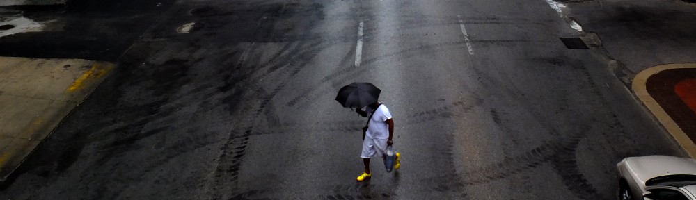
#2- Also a great photo, and love the pop of red in the title. I’d push the color on the name a bit more than you have and pick up the blue puddle color a bit more on your name so that the name is more readable and pops a bit more.
#3- This combination is probably the most commercial, most finished design of the 4; it looks like a cover you’d easily see on a commercial trade paperback. Good as is, looks painterly also, which gives it a more timeless quality. The fact that it looks commercial can be either good or bad, since you may not want to look like a book you’d see everyday, but it also looks like professional quality as is.
#4- Also a great photo. I’d be tempted to extend the light gray mist up to the top of the cover, blending into a solid, and then put that dark blood red title type on top of that. Push the gray at the bottom of the photo into a seamless blend from the photo down to solid black, and use either the road gray or the mist gray for the name text color, as you’ve done. I’d push the color a bit lighter, though, since here again your name tends to disappear a bit. I’d probably use the law of thirds on the top/middle-photo/bottom black for the overall composition of the cover. I think this one and the puddle cover have the potential to be the most striking and stand out the most of your 4 choices.
I’d offer to do some of these cover tweaks for you if it didn’t sound totally presumptuous on my part. You’ve done a grand job of these, in case it isn’t obvious. And the being unable to see them clearly after working on them like crazy is totally normal. ;)
LikeLike
wise comments above.
I relate to the feeling of “they look like I made them.” I guess, unlike letting go of the manuscript, this is more like writing a very tight abstract/introduction, and so letting go of it — though it has to happen — it is a different animal.
not sure that my advice is to add much of anything and many good points were made above. if you are to consider some more tweaks, then this approach [ https://files.me.com/wordstains/agsp3i ] may offer a counter balance, or at best, a jolt for something that pleases you more. not having read the book makes it difficult, and that is the advantage that you have.
LikeLike
You guys are the best. I can’t tell you how helpful this has been.
Fernando, that’s a very cool and intriguing approach–I should have time to play with something like that.
Beckett, I absolutely adore you…and I may take you up on your offer. In any event, I’m studying your suggestions.
Pam, you are sweeter than pumpkin pie.
LikeLike